The Victorian Equal Opportunity and Human Rights Commission (VEOHRC) is committed to ensuring every Victorian is able to live their life free from discrimination. The Commission’s role is to protect human rights, promote fair treatment for all Victorians and to advocate for a diverse and inclusive state.
The Commission engaged Portable to re-envision its brand and the way they presented themselves on their website. They were seeking to address the challenge that many Victorians didn’t know what their role, functions and services were and that the content on their website was hard to navigate.
Portable has a long standing interest and expertise in legal design and in bringing a human-centered approach to the design of digital tools in the justice sector. We are motivated by the desire to redesign justice so that it is more equitable and so that more Australians can access justice. Working with the Commission on the re-design of their brand and website was a perfect opportunity for us to create impact in this core focus area of ours
Design challenge
VEOHRC had a unique challenge for their website since they needed to use their website to fulfil multiple functions:
- to give Victorians up-to-date information on human rights and obligations
- to provide a place for people who have been discriminated against, sexually harassed, victimised or vilified in Victoria to make a formal complaint
- to store educational resources and provide a place for organisations to book human rights training
- to compile relevant publications, legislations or campaign information
Approach
This project was delivered as three distinct phases seeing us define, design and deliver the new website and brand.
Define phase
Stakeholder engagement
We began the define phase by trying to understand some of the internal perspectives on the pain points and opportunities for the website by conducting observations and interviewing a range of VEOHRC staff from each business unit, including Education, Legal and Dispute Resolution, Communications, and Policy and Research. This helped us understand their expectations around what kind of role the website has in their work and what kind of information they would like it to convey to the public. We also ran a series of stakeholder workshops with a variety of Commission teams.
Defining website users
From engaging with stakeholders internally and reviewing previous research we were able to define and prioritise the target user groups of the website. We identified the following user groups:
- Rights holders experiencing discrimination
- Rights holders and duty holders needing more information
- Community groups, allied organisations, and advocates
- VEOHRC staff
- Legal practitioners, researchers, and advocates
Testing with users
There is no substitute for engaging directly with end-users to ensure that the final result will be designed with a consideration for the needs of all user groups. There was a focus throughout the project on engaging with and testing ideas for the website and brand with these user groups including with people who speak English as a second language as the Commission knew that a lot of their clients speak English as a second language. We also sought to engage with young people as a strategic priority of the Commission’s is to engage more with young people so it was deemed important that we incorporate their needs into the research and design phases.

Design phase
Brand workshops
Our Experience Designers then held a collaborative brand positioning workshop with key stakeholders at The Commission, undertaking activities that helped us understand and align on the organisation’s mission, purpose and values with a new brand. We iterated upon moodboards and style tiles through insights gained in workshops. Our designers enjoyed this opportunity for creative collaboration with staff at the Commission and the ability to go broad with design ideas and then regine and iterate on these concepts.
Writing guides
Building on the brand workshop, we created a guide to help VEOHRC staff to deliver its unique information and services to the people who need its help in a user-centred style: clear, useful and friendly.
Visual direction
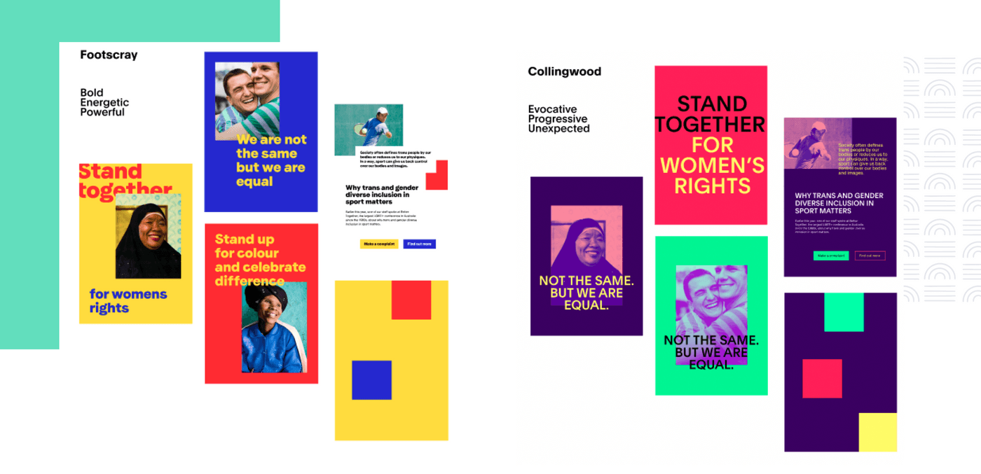
Based on the findings of the brand positioning workshop, Portable presented six visual directions in the form of mood boards, each inspired by and named after various Melbourne suburbs. A walkthrough with stakeholders identified the most appropriate direction. We then began to develop and refine brand concepts through style tiles that best reflected the needs of the organisation and users.

Design system
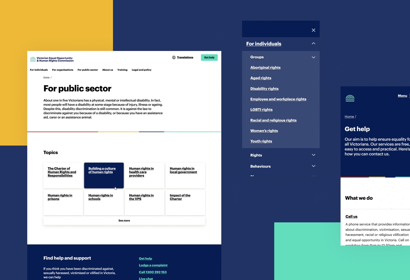
The visual direction work developed during the branding phase defined how the brand elements (colour palette, logo, fonts etc) could apply to the new website. Portable developed design systems, including spacing and typography along the way. This design system will help the Commission to maintain and evolve its brand over time.
Logo design
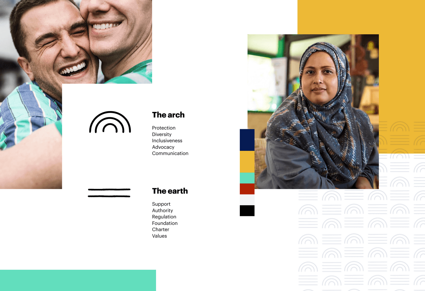
Following this, we developed a new logo with an extended period of low fidelity exploration. The new logo is made up of two components, the arch and the earth. The arch represents the Commission's role as an advocate - protecting human rights and promoting diversity. It symbolises inclusiveness, diversity and shelter offering protection to the people and their rights. The earth represents the Commission's role as an authority dedicated to embedding human rights. It offers all Victorians a supportive foundation to stand on and represents the set of laws and regulations that protect their human rights. The new logo was tested and validated for effectiveness with users, including with people for whom English is a second language and young people entering the workforce for the first time.

Information architecture
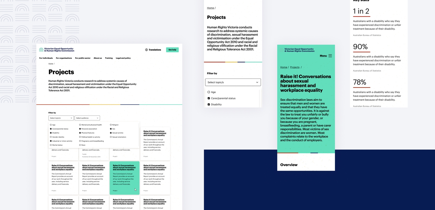
We then designed a website prototype with reorganised content, making it easier to navigate. This was completed by auditing all existing content and redesigning the navigation based on user needs. The content structure was then tested with website users and iterated based on the findings. The result was a clearly articulated sitemap, wireframes and a flexible template suite. Together these assets provided a guide for development, and for the clients in knowing how to build content in their new CMS.
Delivery phase
Site build
Our developers then set about building the site in WordPress. Our Design and Development teams worked closely to ensure the website followed the intended visual layout, design system and content experience. The team created a suite of templates and components and implemented the new information architecture. The new website was launched in June 2020.
Further enhancements
We have since worked with the Commission and our partners, the Languages Other Than English Agency (LOTE), to translate content from core pages on human rights on the website into 10 other languages.
This new translation hub means a greater amount of communities will be able to access important information on their human rights without a language barrier.
This project included a bespoke experience for the Commission’s Content Team where they can create customised sub menus, choose the alignment of text for right to left languages and change/add to the Languages Hub as needed.
We continue to provide ongoing maintenance and support and work with the Commission to release updates such as search functionality and an infographics page to present their organisation updates in an interactive way.

Outcomes
The new site provides an accessible and easy to navigate experience for Victorians accessing important human rights support.
- a clear and easy to navigate website
- a well built and easier to navigate website that is adaptable for additional information and changes
- a new set of brand guidelines (including a tone guide) to create consistency across the Commission’s external presence
- key content translated into 10 languages ensuring language is not a barrier to accessing advice and reporting human rights abuses.
Testimonials
Aram Hosie, Head of Strategic Communications, VEOHRC
"I’ve been involved with a few projects now to completely redevelop a website, and haven’t yet had a launch that didn’t encounter some sort of heart-stopping hiccup along the way. No such thing happened with Portable. The work they delivered for us was very high quality, and their approach all through the project was thoughtful, rigorous and flexible.
Since then Portable have continued to provide an excellent service as they maintain our website and institute further updates and enhancements. They’re communicative, responsive and endlessly patient and adaptable and it’s a real pleasure working alongside them.”