The Wheeler Centre was founded in 2009. It is a Victorian-based Arts organisation, that supports and amplifies the many voices that make sense of the world, through books, writing and storytelling.
The Wheeler Centre exists to support writers, readers and thinkers. Through live and digital conversations, debates, readings, performances and discussions, it deepens public engagement with the most pressing topics of the day. It is dedicated to creative collaboration, community engagement, diversity, and innovation.
The Challenge
The Wheeler Centre partnered with Portable to redesign and redevelop their website to be...
Outwardly focused, more expansive, collaborative, and innovative
The Wheeler Centre is transitioning to a new era of delivery of events in a post-pandemic world, and therefore must innovate their education offering and event delivery. They hoped to achieve this through a sense of authenticity in the way they bring people together, and their desire to change people’s perceptions that the arts aren’t for everyone.
Open to new and fresh perspectives, develop new audiences and bring enhanced recognition of the Centre’s unique contribution to the cultural, social and economic life of the state
The Centre is committed to new strategies that engage a broader audience including younger people, and those who haven’t engaged with Wheeler Centre in the past.
Authentic and reciprocal in its engagement with diverse audiences and communities
Facilitating communities to be heard in an unfiltered manner will be an essential part of the Centre’s strategy, supported by increased accessibility on their digital platforms.
Our Approach
In order to support the Centre’s goal of creating authentic engagement, we began the project by taking a deep dive into the site’s information architecture and content structure. The design research side of this project focused on identifying ways to improve the information architecture, aka the ‘findability and discoverability of content’.
Content & structural audit
We conducted a content audit to identify potential barriers or enablers that block or help people find and discover ‘cool content’. A Google Analytics review supported our findings and helped us to understand behavioural data, site content, site search and website audience information. This provided clues as to how and why people are accessing the information on the Wheeler Centre website.
The structural audit focused on identifying human-readable links on web pages and making sense of how users interacted with these links. This helped us identify strengths, weaknesses and gaps in the current structure of the website.
Tree jack testing and information architecture
The objectives of our tree jack testing activities were to understand the current Wheeler Centre website structure, test our hypothesis with website users and make changes that improve the findability of content based on our test session results and synthesis process.
We also ran a stakeholder information architecture workshop, which built empathy with their existing users and helped stakeholders become aware of barriers blocking, or reducing ‘good’ user experience on their current site. It also provided an opportunity for stakeholders to share preferences for how they think the information architecture should be shaped, and hear our team playback the results from our two rounds of tree jack tree testing.
Wireframes
The objective of the wireframes phase was to take a human-centred design approach to building a strategy to address the goals of the previous phase. Wireframes were created to plan the structure and functionality, they included various interaction states and views, showing the information available on each screen.
Visual design
Using the outcomes of the previous phases as a guide, Portable’s project team began to develop the look and feel of the new website. Portable’s designers and developers collaborated during this phase, to make sure that the design components would work with the build of the website. This allowed for a smooth transition during the final development phase.
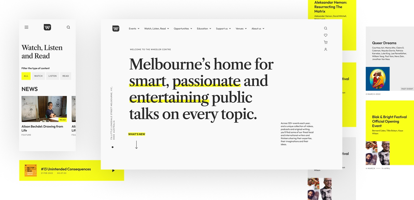
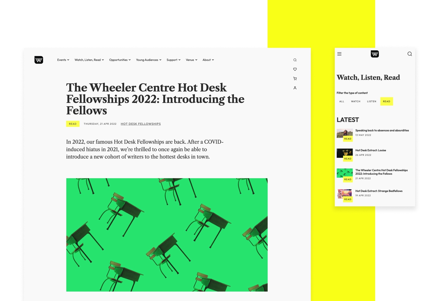
To support the Centre’s desire for a future-thinking website, the brand and style needed to be updated. Style tiles helped to present a variety of visual options for the look and feel of a brand and its collateral, including the website. They included the new colours, type styles, iconography and a basic digital layout. Our final design mimics that of a piece of writing, being annotated, which visitors can see through the ‘highlight’ on text throughout the site. Animations and transitions, such as the secondary menu, also lift the site’s design and provide pockets of excitement for visitors.

The Next Stage
After finalising our visual direction and the functionality of the website, Portable determined the topology of the new database, and created a transformation layer that was used to modify the existing database content into the format required in the new database. We began writing scripts to be able to migrate over 10,000 pieces of content. However, every CMS stores content in a manner specific to the site. Even a ‘lift and shift’ build rarely just imports content, so our process consisted of five key stages that were repeated a number of times in order to get our desired result.
Comprehend → Ingest → Transform → Export → Test
From there, we were able to refine the relationship between each piece of content. For example, an event might have a related series, speakers and images. After our content was in a good place we could develop a strong back end solution for the Centre that would support their ability to autonomously create content and for that content to be easy to maintain.
We built the platform using a modern technology stack, a starter template called Sage, which is a framework built using Laravel and supports PHP 8. By using Sage, we were able to gain access to an ecosystem of tools and resources.
Site Skin Design with TNEW (Tessitura Network Express Web)
By reskinning Tessitura’s TNEW, we were able to create a seamless user experience across the Wheeler Centre’s existing e-commerce pathway for events, account management and donations. TNEW also allows the Wheeler Centre to control that pathway without Portable’s support, giving them the governance and freedom to be able to turn features on and off depending on their current business needs.
A new approach to podcasts
We collaborated with Omny Studio as a new long-term hosting solution for the Wheeler Centre’s podcasts, enabling RSS feeds to be input directly into WordPress.
Project Outcomes
The new website will support the Wheeler Centre’s future growth and their vision to inspire curiosity, connection and engagement through the transformative power of storytelling. It will allow for greater and more meaningful interactions with visitors, both digitally and in person, and will grow with the Centre as they expand into new audiences.
- A new, modern and streamlined platform for the site will make it easier for Wheeler Centre staff to manage and update the site, with or without the support of an agency.
- Connecting with Tessitura’s TNEW provides easy to manage events, user accounts and donations.
- Integrating with podcast hosting platform Omny, rather than continue using a custom-built solution, supports the Wheeler Centre in their desire for long term digital solutions and streamlined services.
Reflections
“As someone with a personal passion for the Arts industry, it’s been so rewarding partnering with the Wheeler Centre and helping them achieve their goals. I love that the new design looks like a piece of paper being annotated and highlighted, it’s such a creative concept.”
- Olivia Gregory, Senior Digital Producer
Project Team
- Senior Producer - Olivia Gregory
- Lead Producer - Allison Snow
- Senior Design Strategist - Aishling Costello
- Senior Content Strategist - Shoni Ellis
- Lead Design Strategist - Joanne Osbourne-Taylor
- Experience Designer - Alexandre Lekic
- Senior Experience Designer - Cristiano Fantasia
- Lead Experience Designer - Melina Hamilton
- Developer - Sonia Montero
- Senior Developer - Lincoln Le
- Lead Developer - Rick Measham
- Quality Assurance Tester - Bryan Maniual
Learn more about using data-driven design
