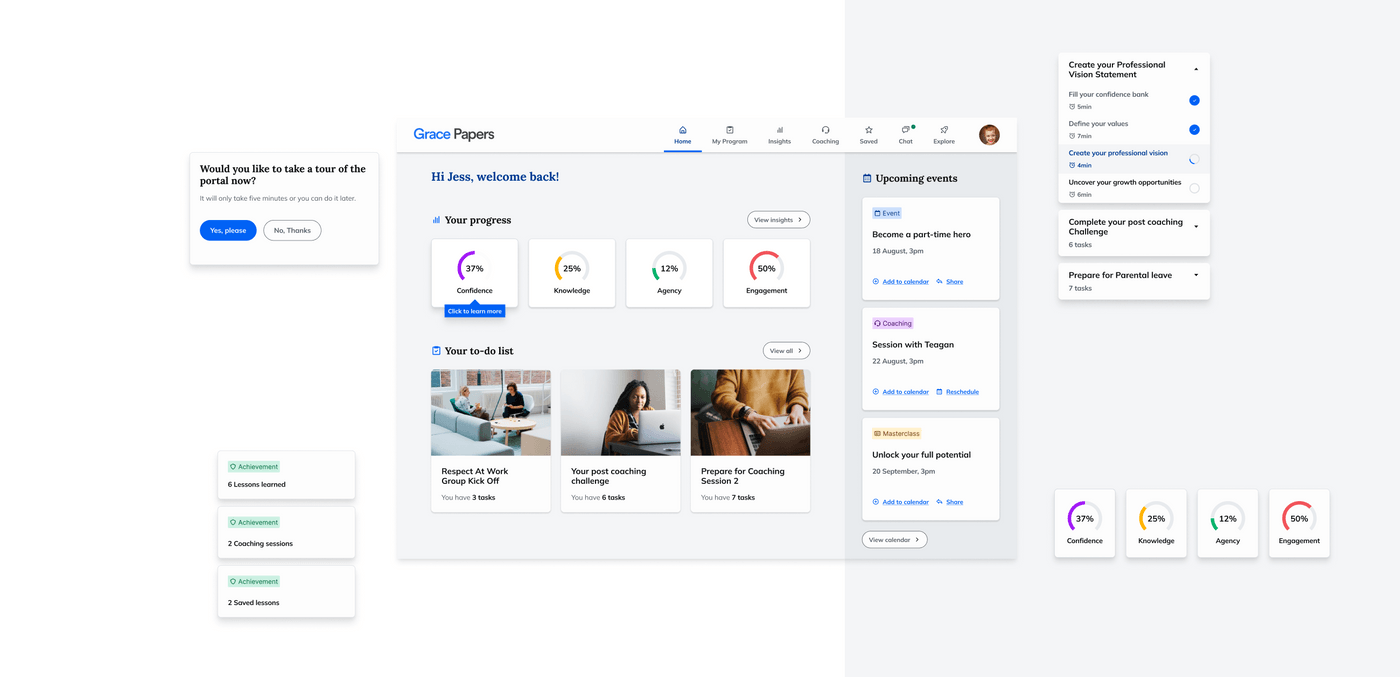
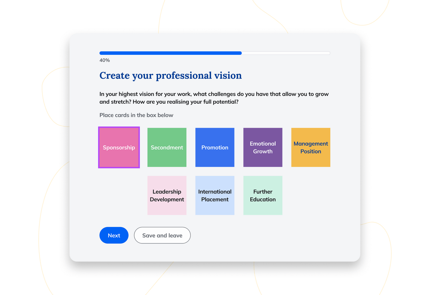
Grace Papers, a renowned advocate for empowering individuals within the workplace through their empowerment model and gender equality systems, were seeking a partner to help them transform their member portal with a brand new design that’s on-brand and which meets the needs of their users. This initiative aimed to enhance user engagement, streamline access to resources, and fortify connections between employees and their professional aspirations while nurturing their well-being.
Grace Papers provides a comprehensive suite of services, including executive coaching and gender equality consulting. Their empowerment model fosters confidence and agency among employees, particularly parents, carers, and leaders transitioning through familial responsibilities. The organisation aims to support their talent in returning to work with newfound determination, contributing to their career advancement

The Opportunity
Grace Papers collaborated with our team at Portable to revamp their member portal.
The challenge involved redesigning the existing portal to align with their brand guidelines and improve human-centred design interactions. Our objective was to ensure seamless navigation, functionality centred around human needs, and an aesthetically pleasing interface.
Our Approach
Our approach commenced with insightful discovery interviews involving Grace Papers' key stakeholders. This initial phase facilitated a deeper comprehension of the project's nuances and enabled us to define a strategic roadmap. Engaging with Grace Papers' stakeholders allowed us to understand and explore the project comprehensively, aiding in defining our approach and deepening our understanding of the specific problem to be addressed.
Following these discovery interviews, we progressed to crafting user journeys that intricately detailed the interaction dynamics within the member portal. These journeys outlined how users engaged with the platform, ensuring a human-centred approach to the redesign process. Subsequently, we meticulously crafted user flows, charting the pathways users would traverse throughout the portal, aiming to optimise navigation and accessibility.
To encapsulate the diverse user needs, we formulated comprehensive user stories. These narratives enabled us to grasp the fundamental requirements and expectations essential for the creation of the new member portal designs. Leveraging Grace Papers' existing brand guidelines, we translated these insights into wireframes. These wireframes served as the foundation, delineating the positioning and hierarchical structure of page components, aligning seamlessly with the established brand aesthetics.
Moving forward, we transitioned from wireframes to high-fidelity designs, bringing the envisioned member portal to life. Executed through the Figma platform, these designs provided a realistic representation of the portal's appearance and functionality. Delivered to Grace Papers, these designs served as the blueprint for the subsequent development phase, empowering them to proceed with implementation in alignment with the envisioned human-centred user experience.
This iterative process, characterised by a meticulous understanding of user interactions and needs, culminated in high-fidelity designs that encapsulate the essence of Grace Papers' vision.

Outcomes
The collaboration culminated in high-fidelity designs that mirror the envisioned human-centred user experience within the member portal. These designs, rooted in the Grace Papers brand aesthetics, were delivered to the client.
Grace Papers took charge of the subsequent development phase based on the provided designs.
Reflections
Working on this project with you has been an absolute joy, and your collaborative spirit, insightful feedback, and trust have transformed it into a truly exceptional success that I'm genuinely proud to be a part of.
- Daniele Milazzo, Senior Designer.
Team
- Joel Langford, Producer
- Daniele Milazzo, Senior Designer
- Jimmy Ness, Design Strategist
- Naomi Wilson, Client Partner