Engineers Australia’s online channels serve a diverse range of audiences with different needs and provide a wide range of resources and information for members, non-members, partners, policymakers, regulators, educators, and students. Engineers Australia sees their main website as the ‘front door’ to the profession: a starting point for anyone interested in engineering.
Their online presence is one of the most important ways they can fulfil their role of growing, supporting and advocating for engineering across Australia, so they recognised the importance of continuing to improve how they deliver their services by redesigning their website.
Building a good website begins with understanding who it should be designed for and uncovering what they need. Engineers Australia understands this, and asked Portable to use our expertise in UX research to create a digital report and draft information architecture to ensure their future website redevelopment is as accessible, easy to navigate, and useful as possible.
Approach
UX discovery research
At Portable, we understand the value in beginning any website redevelopment project by researching how people actually want to use the new website. To enable Engineers Australia’s vision as the ‘voice of the profession’ we needed to start our UX research with the people who their voice resonated with.
We did this through a collaborative research process, running workshops, surveys, and content organisation activities online to enable people from around Australia to participate remotely. We worked with over 50 engineers, students, academics, and executives to map their needs and expectations of EA’s future digital presence and to co-design the information architecture for a future site.
User group identification
From this, we defined the key user groups for the website, exploring and validating their needs as well as revising the information architecture to make it easier for people to find what they need - whether it’s the ability to connect to a community of engineers or to learn what it’s like to be an engineer in Australia.
We identified mid-career engineers who are members of EA as the primary user group, given their repeated, transactional use of the site and need for access to the EA membership resources to boost their career. Most of the people we identified in this user group were somewhat involved with EA, but didn’t feel they were getting the most out of their online experiences. Focusing on this user group also aligned well with the post-Covid shift to offering more online educational resources and networking opportunities.
Personas and journey maps
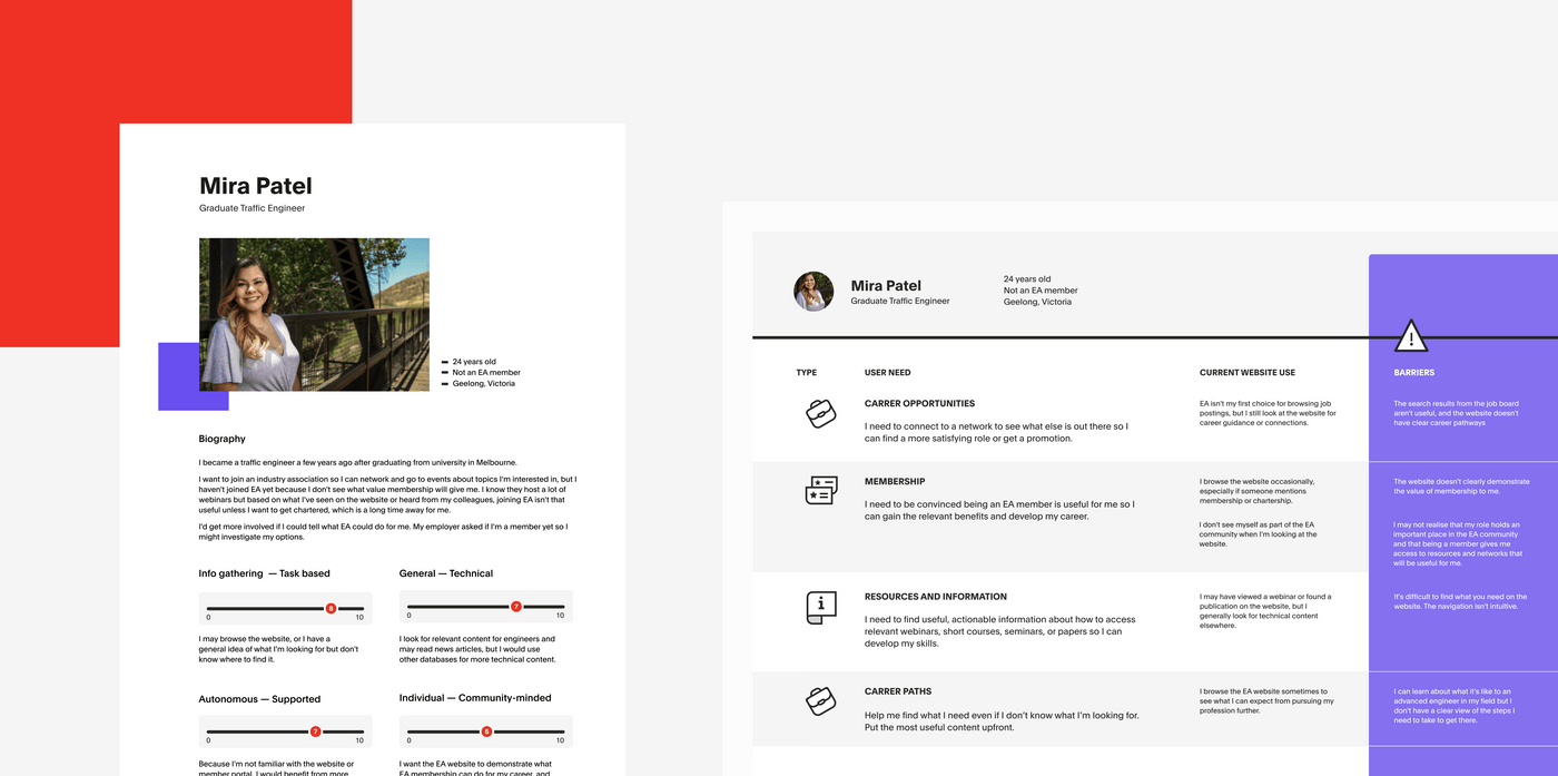
We further helped refine the direction for the website development by creating personas and journey maps for recent engineering students, mid-career non-members, late-career members, and recent graduates (especially those who may work in emerging areas or careers that aren’t catered for by traditional EA resources). By segmenting user groups by their goals and tasks, EA will be able to define user pathways and make their information and resources accessible to a wider range of users.

Synthesis and recommendations
After synthesising our findings, we provided Engineers Australia with clear visual representations of our research through user personas and journey maps. We also provided recommendations for the key requirements of a new digital presence that places its users at the centre of the website’s design, content and delivery of services.
Delivering an online-based website strategy
To make it easier to share our project deliverables, we decided to explore a new way to share research online. Given the success we’ve been having with running collaborative research projects online, we decided to use what we know about presenting information online to turn our final report into an interactive website using ReadyMag.
Building our report as a website gave our design team the opportunity to create more visually engaging reports. It enabled us to draw attention to key insights in the report by creating a visual hierarchy along with animations to illustrate different themes. Having the research findings in a cloud-based format also made it easier to share throughout the organisation so that we could collaborate and update the report throughout the delivery process. As a platform, ReadyMag is perfect for creating responsive, digital design at speed. Our team can incorporate animation, interactivity and custom layout to accentuate the content in a way that isn’t possible with traditional, print-based outputs.
Report UI design
Creating a better layout for our report improved both overall experience for the EA team and increased how the insights could be shared and received. Online reports are more easily scannable, optimized for mobile, and can embed links to other PDF documents as needed, so people can go back and forth between different content. Online reports are also easily shareable as a URL link, so people across the organisation can understand the foundations of the website redevelopment project and buy into our human-centred approach.
Outcomes
- Conducting qualitative and quantitative discovery research to identify who uses the site, their intentions when using it, the primary tasks they’re trying to complete and the content they’re trying to find.
- Designing a representation of the EA digital ecosystem to demonstrate where the main website sits within the range of their online services, and how many clicks it takes to get to those resources from the homepage.
- Creating a revised new IA that we tested and validated through card sorting and tree testing.
- Delivering an online report that was able to visualise our user research and recommendations, providing the opportunity to convey findings in a way that makes them easily accessible. This will provide a human element for future designers and developers to consider and empathize with when building the new and improved Engineers Australia website.