The Office of Suburban Development, in the Department of Jobs, Precincts and Regions (VIC), are responsible for coordinating development activities in metropolitan Melbourne across all relevant departments and agencies, to add value and complement work already underway, remove duplication, address gaps and achieve positive outcomes for local communities.
The Office of Suburban Development are tasked to produce Five Year Plans for Jobs, Services and Infrastructure. Plans). Five Year Plans are created for each of Melbourne’s six metropolitan regions annually. They provide regional level data on the demographic and economic features of Melbourne’s regions, highlight Government’s major investments from the State Budget at a regional/suburban level, and present the Victorian Government’s response to a region’s Metropolitan Partnership advice. The Office of Suburban Development currently have six community partnership boards who provide advice on their local area’s priorities.
They selected Portable to investigate the ways in which State budget information at the regional level could be better communicated to the partnership boards and prototype a solution.
The Challenge
The Office of Suburban Development wanted a user-friendly and accessible approach to the dissemination of this key information. Design challenges like these are exactly what drive Portable’s interest in working with government. We are motivated by projects when their aim is to realise innovation in the public sector through the transformation of a service or program so that it can better suit the needs of government or the community it serves. As well as working with a large range of government departments across Australia to realise innovation in government, we have also undertaken our own research and development into this area having published our report ‘Hacking the Bureaucracy.’
We, therefore, welcomed the opportunity to work on this project and the chance to use human-centred design principles to solve the design challenge presented to us.
The Discovery Phase
Desktop research
Undertaking desktop research and a market scan to understand examples of best practice. Our desktop research focused on discovering and understanding other Victorian Government projects and examples of inspirational use of digital storytelling in adjacent spaces.
Our research also consisted of activities aimed to enhance our understanding of the roles of the stakeholders involved in the creation of the current 5-year plans and the structure and content of the plans themselves.
User interviews
Undertaking 13 x on-sight user interviews with stakeholders and experts involved in the creation of five-year plans and members of the community partnership boards. These interviews aimed to understand the needs and perspectives of stakeholders when seeking out and interacting with the information contained in the 5-year plans, and the processes involved in creating the plans.
This research resulted in a series of insights, quotes and observations that were then synthesised by our designers to create a list of key insights which were presented back to the Office of Suburban Development.
Personas and Journey Maps
We then designed a series of user personas to visualise the pain points and needs of different types of stakeholders.
Following which we co-created journey maps of the current state experience of the creation and interpretation of five-year plans and state budget details with a group of staff and state government stakeholders.
The Design Phase
Co-design
We then moved into the design phase of the project where we facilitated a series of co-design workshops with stakeholders and experts across state government portfolios and metropolitan partnership members themselves in attendance.
The co-design workshops explored and defined the user experience and tested goals against identified platform features that workshop participants felt a prototype solution should have. In groups, participants created their own prototypes with informed rationales for each feature, matching a feature specifically to each user experience goal. They also chose secondary features that they also felt would be beneficial to the user experience. Features were then voted on by participants, and the scores were collated by our designers.
User experience goals
We then synthesised workshop outcomes to determine the most commonly desired and the most likely to be used features and identified the core user experience goals. These user experience goals focussed on the problems that could be addressed by the front-end user experience of the prototype solution. These goals act as user acceptance criteria for prototype functionality effectiveness.
Prioritising features
We then produced an expansive list of 20+ ‘features’, a diverse suite of interface elements and pieces of content, were created. Each feature was designed to potentially address one or more user experience goals. To help us prioritise these features, and learn more about why and how they could achieve our goals, Portable designed and facilitated additional co-design workshops with stakeholders and experts across government departments and in the metropolitan partnerships. Through this prioritisation exercise we were able to distil the list of required features to a core set of 11 features for a prototype solution.
Example priority features included:
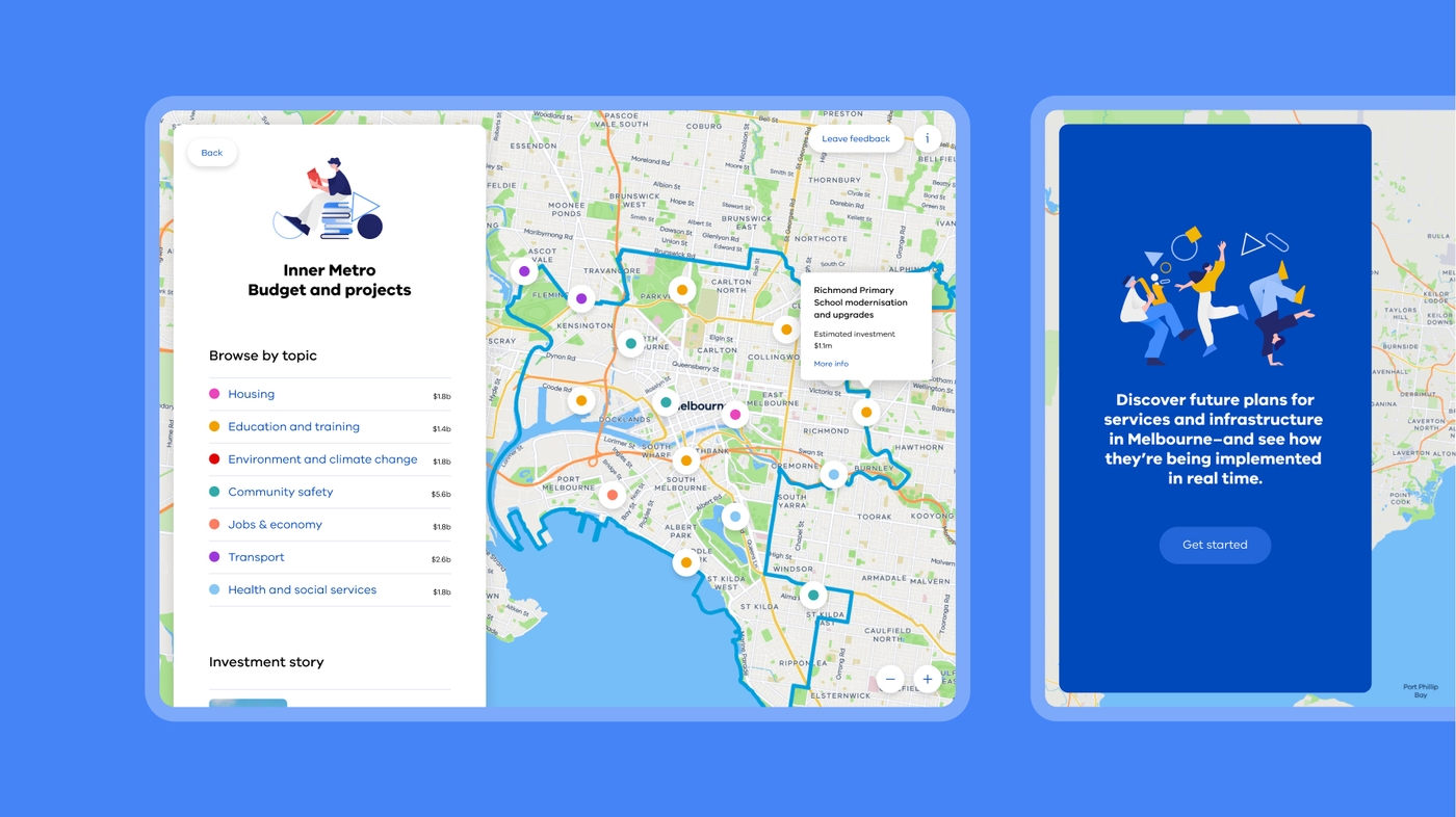
- the need to provide a map interface which allows users to filter the view to a particular region.
- A visualised data breakdown to provide budget data, tables and timelines into accessible, easy to understand information.
- Story snapshots telling the story of budget expenditure or of newsworthy information and events for particular regions.
Prototype design
Following this, our design strategists worked closely with our experience designers to design a high-fidelity prototype. The final prototype presents a solution to the design challenge presented to Portable in the form of a new digital information service for communities and community partnership boards. It provides a user-friendly and accessible interface which breaks state budget information down by region and by budget category (e.g. education, housing, transport).
The final prototype implemented the priority features and combined them into a single platform that helps to meet each user experience goal in various ways. It was understood that the final experience should be fluid, modern and intuitive, which is what we sought to provide.
Implementation Planning
Our Head of Development, Chris D’Aloisio, and members of our Business Development team then began to work closely with the design strategists and experience designers involved in the project to write up an implementation plan for future phases of the project which would see the new digital information service built and integrated into the Office of Suburban Development’s existing website.
Rather than taking the easy approach of pitching a new, standalone digital product that simply met the stated goals, we went a level deeper and ensured that our proposed solution worked within the strategies and systems already underway that allow the government to centralise and unify their suite of digital products. Our final implementation plan allows the client to collaborate with wider government agencies and departments in generating a solid and well-considered business case. The Office of Suburban Development is supported in their next steps of implementation through the relationship that Portable brokered for them with another government department with shared goals and an interest in bringing the platform to life.
We presented this back to the Office of Suburban Development and provided them with a bespoke built showcase website on Squarespace designed to bring the research alive and take them through the story of the project, the research assets and the high-fidelity prototype.
Project Outcomes
- Co-designing a solution to improve the dissemination of important information on government expenditure in communities.
- Supporting a government department in understanding the next steps to implement the solution by providing them with a clear roadmap for implementation.
Project Team
- Adam Corcoran - Design Strategy
- Allison Snow - Producer
- Chris D'Aloisio - Technology Lead
- Cheyanna O'Connor - Business Development
Get your copy of our guide to data-driven design
