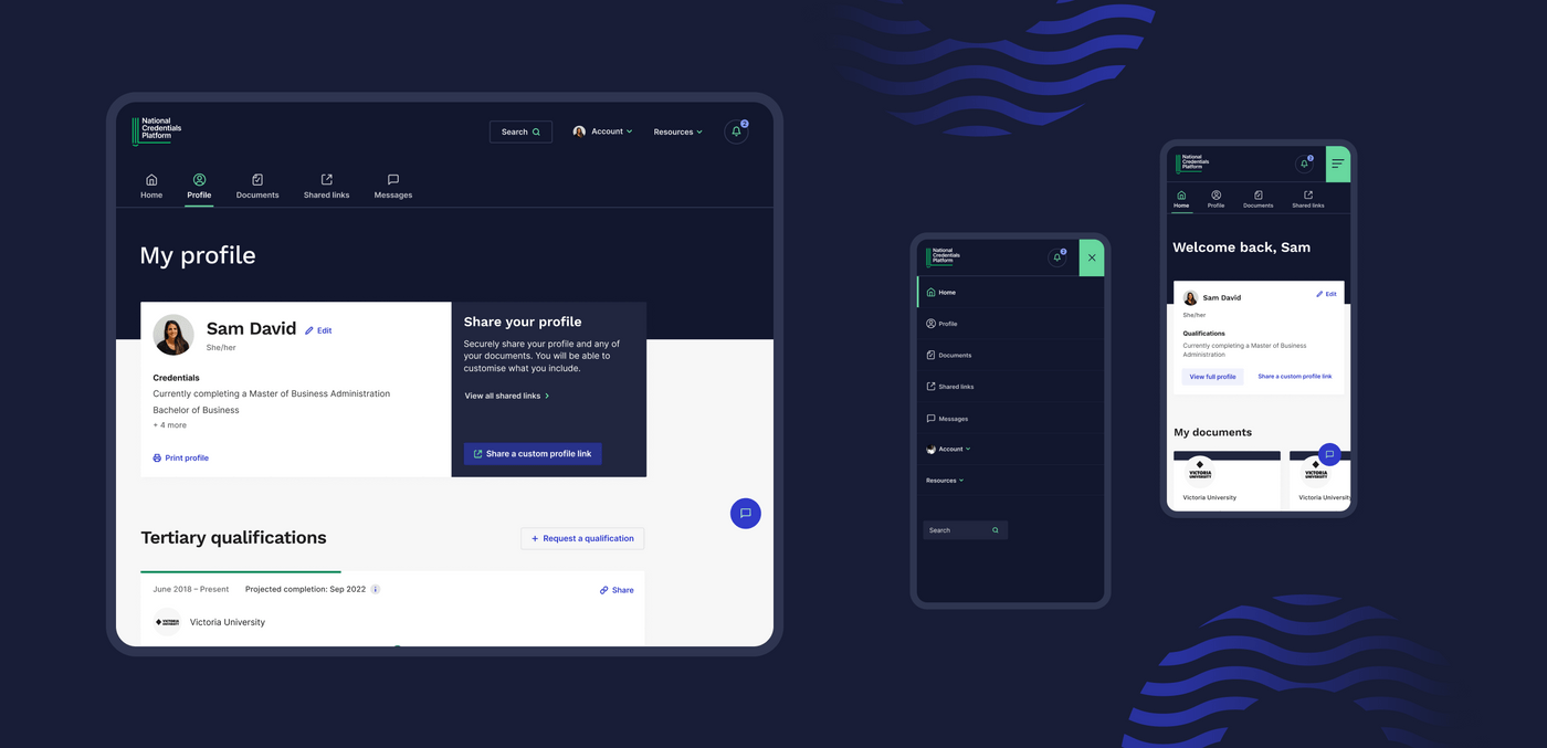
The Department of Education, Skills and Employment (now part of the Department of Education) engaged us to create a concept design for a national micro-credentials platform. The national micro-credentials platform, later named the 'Microcred Seeker' is intended to act as a secure library of a learner’s higher education achievements, enabling them to gather, display and share their Australian Qualifications Framework qualifications and credentials.
The Department had already completed an Alpha phase, which focused on user research with learners and employment seekers, employers, and tertiary education providers, to identify opportunities for the features, function, and layout of the National Credentials Platform. Our task during the Beta phase was to design the National Credentials Platform’s brand and platform prototype, ready for the Department to progress to the next stage of their project.

Design challenge
We needed to design an online platform that offers a secure, central source to learners and employment seekers looking for easy access to a complete and comprehensive record of their credentials. A core consideration of the brand and user interface design was to ensure it was accessible and easy to navigate.
Approach
Before we dived into any design thinking, we started by reviewing the extensive research reports from the Alpha phase. This gave us an in depth understanding of the thinking and research already conducted for the National Credentials Platform.
We also defined a set of objectives to help guide us through the project:
- Design a look and feel of the National Credentials Platform brand that aligns with what learners, education providers and employers want and need.
- Use language that is tested with, and familiar to, learners/employment seekers.
- Create a narrative around the purpose and value proposition of the National Credentials Platform.
- Create communication materials that help the Department to clearly articulate what the National Credentials Platform is to key external stakeholders.
- Develop a look and feel and language that allows the National Credentials Platform to adapt and grow in the future, such as incorporating non-Australian Qualifications Framework credentials.
- Support the development supplier in building the National Credentials Platform.
Defining the brand
Our first task was to understand what credentials sharing platforms, tools and organisations already existed in the education sector. So we started with a desktop review, looking at different examples to get a sense of what branding stood out and where the Department could be a point of difference.
From here, we facilitated two brand workshops with the Department, to understand and define the National Credentials Platform’s brand, including its positioning statement, value proposition, key audience groups, brand characteristics and tone of voice. This paved the way for us to design three high-level brand directions for the National Credentials Platform, before we refined the Department’s chosen direction.
Value proposition statements
The value proposition statements called out four key selling points of the National Credentials Platform:
- The platform would be a centralised source, allowing easy web access to learners’ comprehensive credentials, microcredentials and general capabilities history.
- The platform would offer a standardised system, housing government-accredited credentials acknowledged by industry sectors.
- The platform would be safeguarded and trustworthy via government backing, protecting the privacy of its users.
- The platform would allow learners and employment seekers to curate and distribute only the most relevant credentials, tailored to the role they’d be applying for, and/or the person they’d be contacting.
UI design and testing
Building on existing insights from the Alpha phase report, we designed two prototype experiences for the primary audience groups; learners, employment seekers and employers. We ran two rounds of usability testing sessions with these audience groups, to identify usability issues early on and to further build on our insights, while expanding the detail. We used the insights from testing to tweak and refine the user interface and to develop more in-depth interactions.
A key feature involved developing a way for learners and employment seekers to select relevant credentials and securely share them with potential employers or universities. Considering the sensitivity of the information they would be sharing, it was crucial that people using the tool could intuitively edit, manage and customise their shared links.
Visual application of the chosen brand
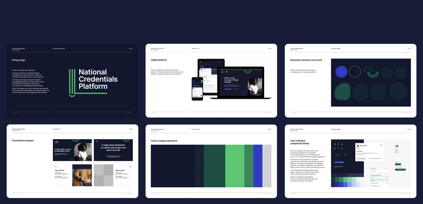
Alongside uncovering the brand, we set about to determine the look and feel of the platform itself. For the visual application, we created a visual connection to physical documents and certificates, through the use of soft shadows, white card components and overlapping elements. This helped the platform have a sense of depth, similar to that of a stack of printed documents. We ensured that both the design and brand were flexible and dynamic, so that future iterations of the platform would maintain a consistent user experience.
Wrap up
In the final stage of the project, we designed clear guidelines for the brand and packaged up the UI assets, which we handed over to the Department - providing them with a clear, user-validated direction for implementation on the front end of the platform.
Outcomes
We handed the baton over to the Department, so that they could progress to the next stage of building a platform that will keep the audience at the forefront and enable learners and employment seekers to share curated credentials safely and securely to potential employers.
The brand foundations created in this project gave the Department the tools to communicate and share the value of the National Credentials Platform to key stakeholders, beyond just the platform itself.
The Department has since launched the platform in partnership with the Universities Admissions Centre. It is Australia's first micro-credentials platform and allows anyone to compare short courses and helps them understand how they can be stacked and used for credit towards a complete qualification. All TEQSA-registered higher education providers in Australia have been invited to participate in the launch, with other education providers able to be onboarded in future phases.
So far 49 providers from all over Australia have joined the platform, offering more than 240 courses, with many more expected in the next few months.

Reflections
Ashleigh Whyte, Student Projects Coordinator for the National Credentials Platform, Department of Education, Skills and Employment
“Portable’s approach focused on the end-users of the NCP and their final products exceeded our expectations. Portable were very professional and a pleasure to work with, they were extremely supportive throughout the project and we appreciate their continued communication with our team.”
David Christie, Managing Director of the Universities Admissions Centre who launched the platform in partnership with the Department
"This is a wonderful example of government and the higher education sector working collaboratively to deliver really useful information to a broad community interested in learning, educating and upskilling. The technology behind it is truly innovative, but at its heart it’s about giving people access to the knowledge they need now and that will be needed for the jobs of the future."
Jackie Garfield, Senior Experience Designer, Portable
“The Department of Education, Skills and Employment came to us with an exciting concept for how credentials could become accessible online. Workshopping their value proposition early on in the project allowed both teams to align on a product vision, which paved the way for how we approached the brand and experience of the platform.”
Portable's project team
Lauren Manning, Senior Producer
Jackie Garfield, Senior Experience Designer
Ash West, Lead Experience Designer
Emily Pearce, Senior Content Strategist
Cass Eddy, Lead Brand Designer
Tim McDonald, Content Strategist
Allison Snow, Lead Producer
Kerri James, Senior Client Partner