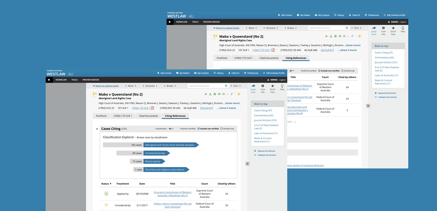
Lawyers need to find the right information as quickly as possible, and the text-heavy interface made navigation more difficult than it needed to be. Thomson Reuters Legal engaged Portable to bring a user-centred approach to redesigning key parts of the Westlaw interface.

With 50,000 users and hundreds of thousands of case records, Westlaw is the go-to legal research tool for lawyers in Australia. But with such a depth and breadth of information available, the user experience was suffering. Lawyers need to find the right information as quickly as possible, and the text-heavy interface made navigation more difficult than it needed to be. Thomson Reuters Legal engaged Portable to bring a user-centred approach to redesigning key parts of the Westlaw interface.
The expertise used in this project included:
- Information Architecture
- Research
- User Testing
Working with the Westlaw product team, our approach focused on two key elements of the interface, the heavily-trafficked ‘case page’ and ‘related document’ functions.
- Portable designed and facilitated a co-design workshop with client and user stakeholders that looked at ideating different ways information could be presented, as well as determine which components of the interface are of most importance to users. This complemented rigorous consultation with the Thomson Reuters technical teams, situated around the world, so we could understand how the backend works and determine what design ideas were feasible.
- After exploring and framing the problem, we used the insights we’d uncovered to inform the design of a prototype. We set about improving how users experience the case page, which is currently presented as a single page displaying an individual case with lots of complex information, by redeveloping the information architecture and content hierarchy, as well as the page’s visual design.
- The related documents functionality is currently accessed in multiple ways, each containing information relating to the source material. To improve the usability of this function, we looked at ways to restructure how related documents are presented, categorised and navigated to, as well as visual ways of showing them and their relationships.
Outcomes and benefits:
- After multiple rounds of prototyping, Westlaw now possesses rigorously-tested designs for two major components of its user interface.
- By presenting the case files and related information in a more visual way that’s easy-to-read and navigate, the experience for Westlaw’s users will be drastically improved.
Download our report on innovation in the justice sector
