headspace is the national youth mental health foundation, providing early intervention mental health services to 12 to 25 year-olds. Since inception, headspace has provided over 3.6 million services to more than 626,000 young people across Australia. Services are confidential, free or low cost. headspace sites are found in more than 130 communities around the country and aims to ensure that all young Australians are mentally healthy and engaged in their communities.
Following our first engagement with headspace, where we sought to unify their digital presence, headspace approached Portable to enhance the online experience of its young service users through the use of interactive content, tailoring an individual user’s experience of the site and providing a new way to engage in behavioural change and improve wellbeing. Research shows that people are more likely to change their behaviour if they interact, set goals and receive tailored suggestions.
This new service would form a functional enhancement of the website and build on the work that our team had already done on conducting extensive user research, redesigning and rebuilding a unified digital presence for headspace.

Project context
The clinical information in Orygen’s "Brief Interventions In Youth Mental Health Toolkit" sparked conversations about ways in which the website could be utilised to present this content in visually engaging, mobile-first and interactive ways.
Orygen provided this content to headspace to bring alive on the website for young people to engage with so that more young users of eheadspace services can access the useful content from the toolkit. We approached this design challenge by working closely with headspace clinicians to understand the clinical information.
Approach
Content design
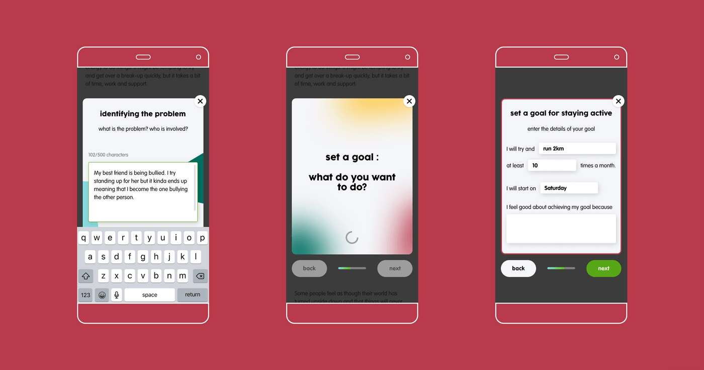
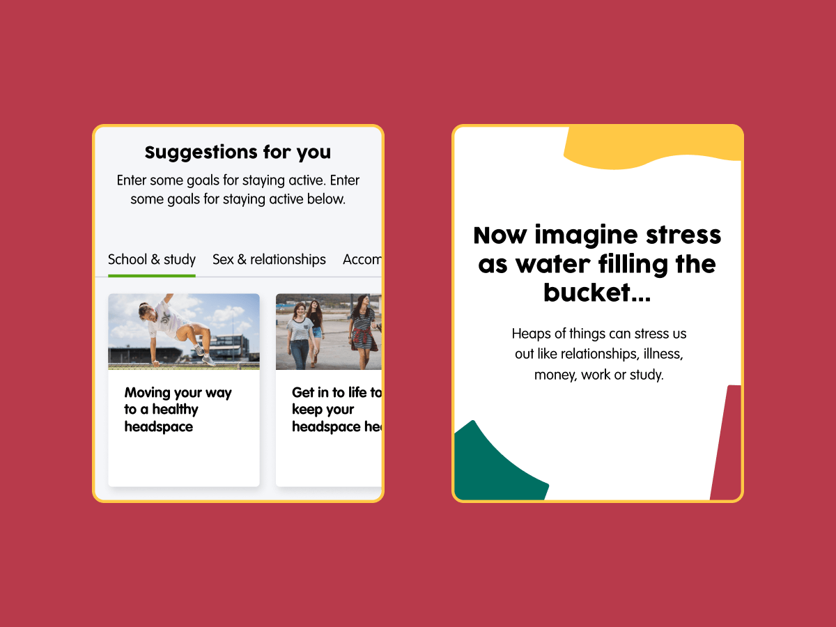
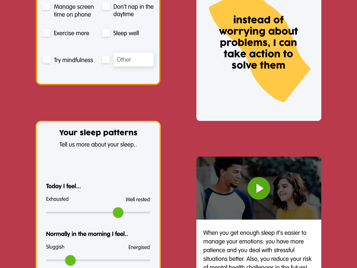
- We reviewed the different ways that the content could be interacted with in a mobile first experience — exploring videos, visuals, storytelling, the importance of self reflection, setting goals, and receiving suggestions based on inputs to help provide recommended resources for further reading.
UI design
- There was a strong focus on small display sizes and touch interactions to prioritise the mobile experience of the platform.
- We took cues from common social media platform patterns.
- This was also our first opportunity to design within the refreshed headspace brand identity and refine our approach to fit with the overall look and feel of the new website.
- Ensuring clear and consistent presentation of content for the most comfortable reading experience possible was also a key consideration of ours.
Prototypes and user testing
- After gaining an understanding of the clinical framework we needed to support, we designed mobile prototypes that we took to young people to seek their feedback on and iteratively refine.
- User testing sessions with young people also helped us to identify what features of the new tool headspace’s online audience would value most.

From these user testing sessions with young people, we learnt that...
- The young people (users) value being able to return to a deck they have either partially or fully engaged with and have their responses stored.
- A strong factor in why users find decks comfortable to engage with is that reading is regularly broken up into smaller sections that they can jump between and interact with.
- Users want to be able to share decks with others.
Visual design
- We then facilitated a one day scoping workshop with headspace to determine the exact Minimum Viable Product deliverables.
- Once we defined the prioritised features we defined the user stories and acceptance criteria and moved on to finalising the user interface design ready for the development phase.
Development
- After completing rounds of testing with young people, we moved into the final development phase.
- In order to build something as customised as Decks, our technical team worked closely with the designers throughout the process in order to advise on the technical requirements for the build.
- We built the foundation of Decks with the ability for content admins at headspace to build, edit and publish their own Decks within the Content Management System at their convenience.

Outcomes
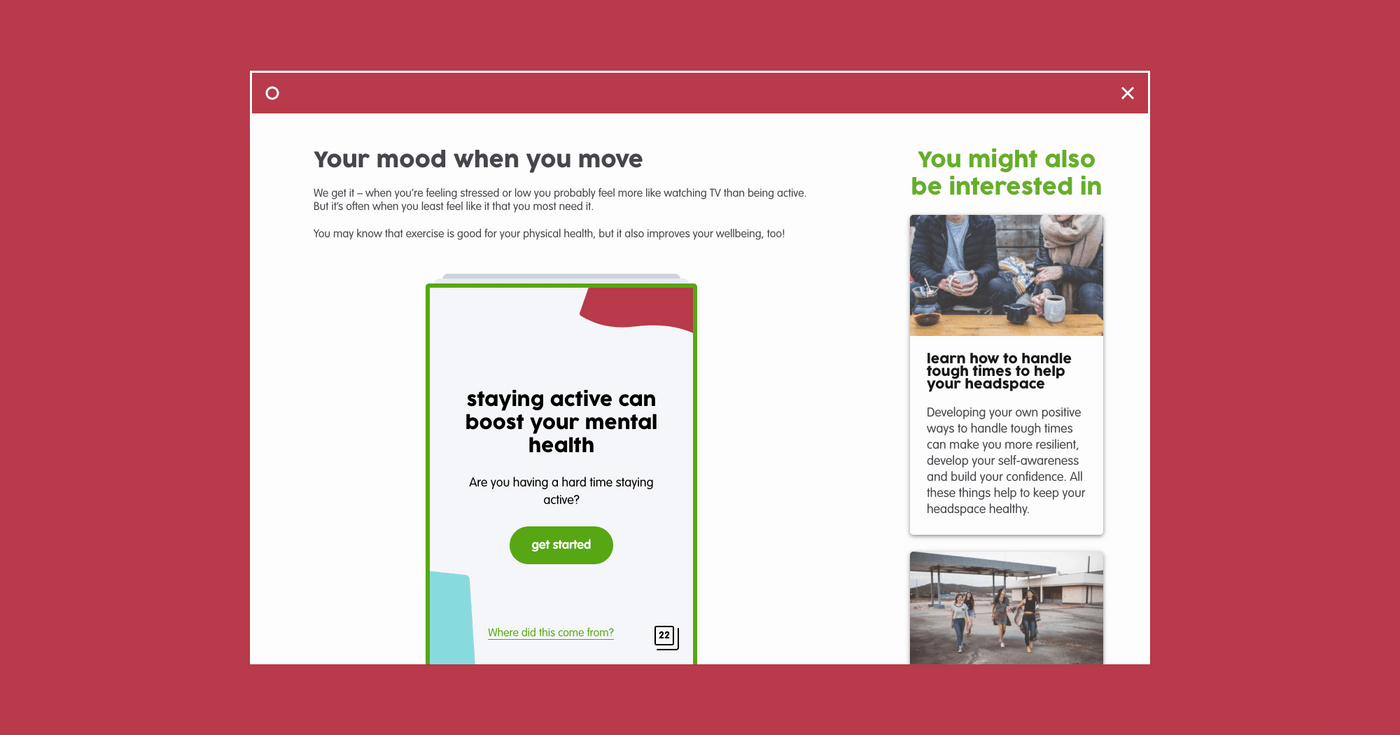
- We designed and built a mobile-first experience which enables headspace to create individual sequences of interactive content "cards" into a "Deck" through their website CMS. Differing card types support differing types of interaction and can be connected with one another based on rules to give users a tailored experience.
- Decks forms one of the key stepping stones to providing an ecosystem of integrated services using the website. It provides self-guided bite-sized content for young people to interact with at their own pace, reflect on, set their own goals and concludes with tailored resources for further reading.