Context
The Department of Primary Industries NSW Biosecurity and Food Safety division have a variety of digital applications used by stakeholders and staff working in assessing biosecurity and food safety. These applications are all managed by different third party providers, and are all used to complete different actions such as submitting licence renewal applications for biosecurity registrations. Other applications include the BioMAP which provides search functionality for property disease history, performing location analysis and tracing disease outbreaks across geographical areas.
Some of these applications are public facing and others are internal only. Some also link between each other while others stand alone. As these applications are managed by different stakeholders, there is a disconnect between each of the applications in terms of visual design, brand and user experience. The Department was therefore in need of a visual overhaul of the varying UI of the applications and a uniform design system.
The challenge was that each piece of software had different components and core user interactions requiring a design update. In order to deliver a unified user experience, the Department also wanted to use the NSW Design System for a redesign of all software components and create a new identity that could house all software under a consistent brand.
We were tasked with helping the Department to create a consistent experience no matter which application people were interacting with, and to provide the Department and its stakeholders with a clear path forward to implement redesigned front ends which could transform the user experience.

Approach
Heuristic evaluation
We started to explore and analyze the Biosecurity and Food Safety applications by undertaking a Heuristic evaluation to investigate the usability of each application and guide future design phases. We used Jakob Nielsen's 10 general principles for interaction design as a guide for best practice and to assist us in identifying potential usability and branding improvements.
User interviews
To support the outcomes of the heuristic evaluation and cross-check our findings, we conducted 16 user interviews with staff from different areas of the department and end users of the software to collect insights and find pain-points specific to each application.
Most of the insights we found referred to usability problems, functionality and lack of documentation on how to use the applications such as onboarding guides. We gathered the information into a report and presented our recommendations for future feature updates and the user interface design back to the Department.
Understanding the technical landscape
We ran several workshops with the Department’s Stakeholder Technical Teams to understand the technical limitations of each application to guide our design team in understanding what limitations there were across the applications in terms of making front end changes. It was identified that changes could be made to spacing, colour, typography and iconography across the applications.
Logo design
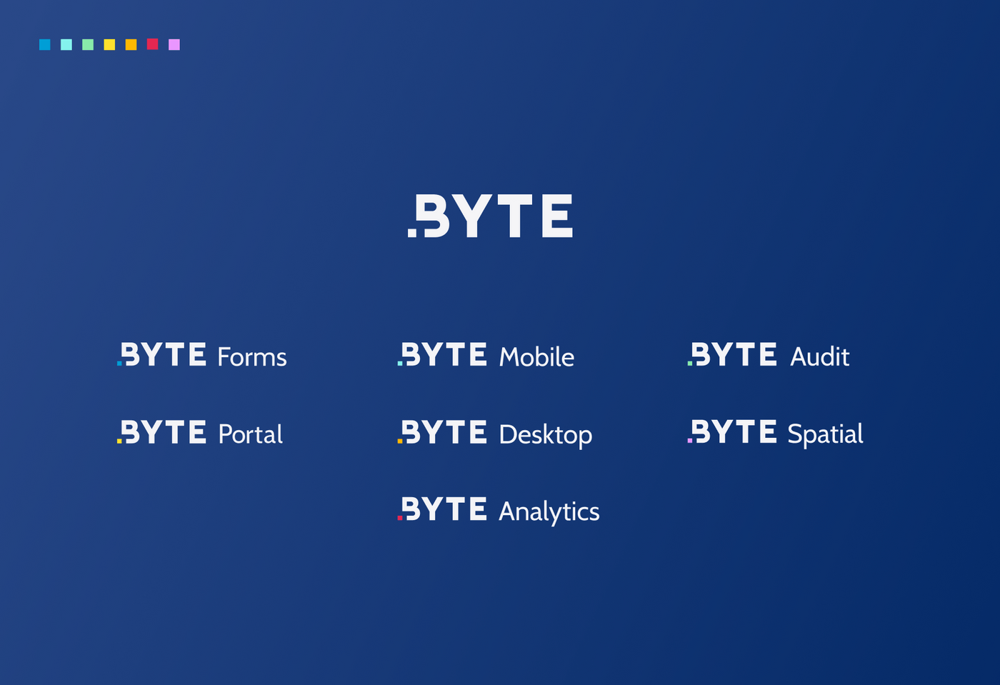
BYTE is the umbrella brand name for a suite of DPI Biosecurity & Food Safety applications. The name BYTE was already in use by the organisation. During initial user interviews, it was clear that the name already resonated with users, felt familiar and was widely liked within the teams. Because of this, we opted to continue on with the original brand name, and focussed on overhauling the visuals and building consistency within the various sub brands. Each application maintains ‘Byte’ in the name and then has a sub-name which connects to the application’s use, for example Byte Portal.
To us, BYTE was already the perfect synthesis of two core components of the BFS service:
- BYTE is representative of technology, digital, information and bits.
- BITE refers to biology, nature and food.
The new logo is a visual interpretation of these two ideas. A byte is a binary unit of information, consisting of eight bits. The bit can assume the form of either 1 or 0. We represented this construct through a positive pixel (1) and a negative pixel (0), with the intentional use of negative space.

Interface design
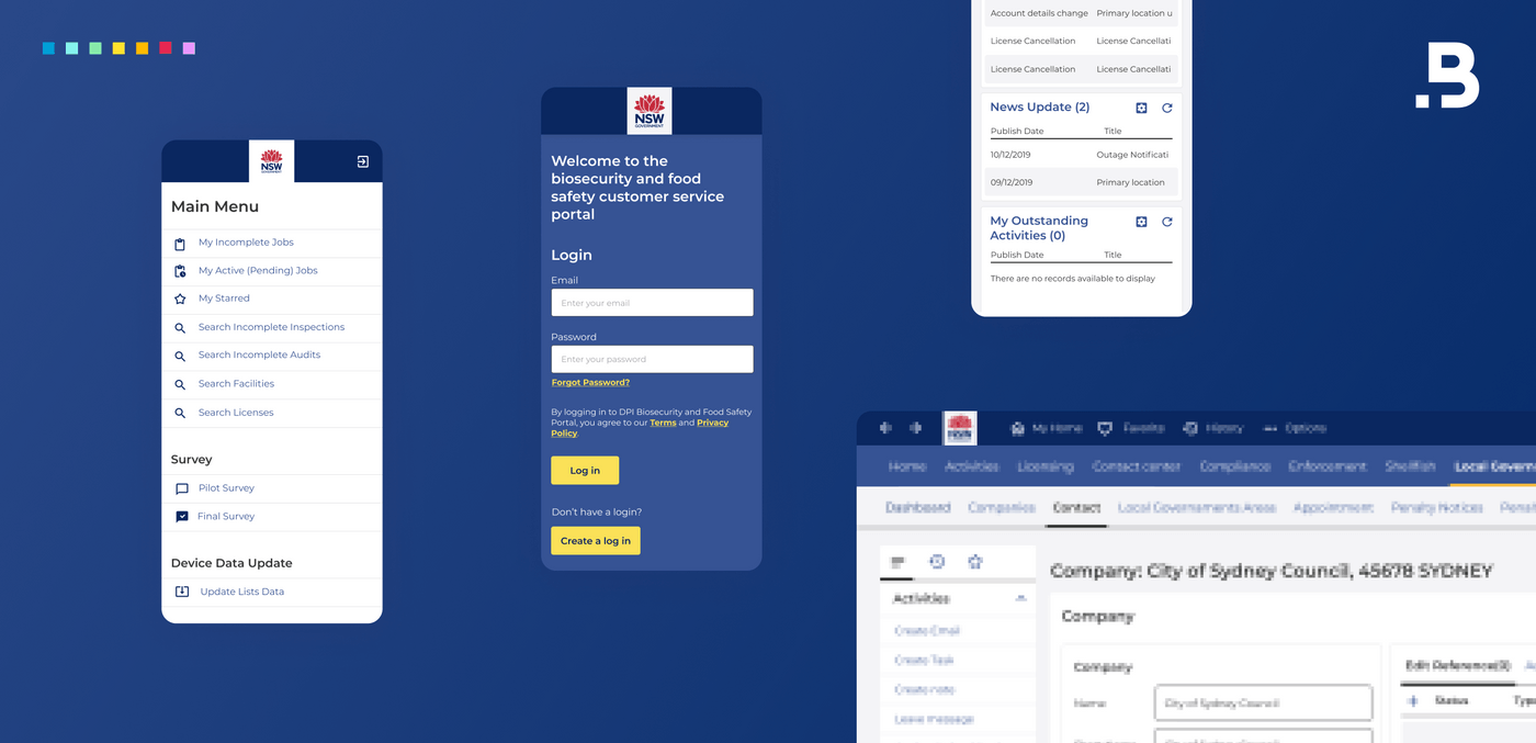
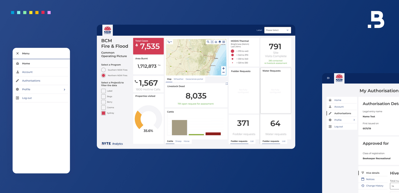
We meticulously followed the guidelines set out in the NSW Government Design System, to redesign the 7 applications. Using this system, allowed us to efficiently create consistent, user-focussed experiences. Despite extensive technical limitations, and the constraints of varying development environments, we were able to deliver a suite of applications that felt consistent in terms of interface and experience. The interfaces all use the same UI elements, and share foundational pieces, like grids, typography and colour. What differentiates each of the applications, is the naming convention and use of individual highlight colours.
Defining a new brand and style guide
We worked on the branding for the suite of applications and provided an overarching style guide which conformed with the NSW Government Design System. We also provided the Department with a clear path forward to maintain consistency in design and the look and feel of the interfaces of all the applications which sit under the umbrella name of ‘Byte’’.

Outcomes
The results from this work are being used to inform and assist the Department of Primary Industries in having a suite of applications that have a consistent look and feel and provide a great user experience.
DPI BFS are taking the UX recommendations, prioritising and rolling out across the applications by working with their development teams and stakeholders, using our Brand Guide and Digital Guidelines to achieve consistency and uniformity across the suite of applications.
Testimonials
Debbie Brookfield, Manager Business Systems, Department of Primary Industries NSW
“The user experience review was a challenging project, to harmonise the experience for our users across so many applications, each with different technical limitations, across desktop, web and mobile apps, all while working within pre-existing government design guidelines. Portable provided an approach that put the customer at the centre throughout the journey. Their recommendations helped us to streamline and simplify user interactions. Portable's design team remained available to us for guidance and assistance, enabling us to refine the design throughout implementation. The result is a modern interface across our suite of applications.”
Project team
Tom Morris, Senior Digital Producer
Jake Hogg, Lead Experience Designer
Cristiano Fantasia, Senior Experience Designer