2018 marked the 20th anniversary for Breast Cancer Network Australia (BCNA), the leading organisation for Australians affected by breast cancer, with more than 120,000 active members at the time.
BCNA was looking to update its digital strategy and redefine its presence in anticipation of this milestone, ensuring that any decisions made were led by insights surrounding the wants, needs, and challenges of those seeking information and support through tailored resources and services available in the space.
A fundamental service supplied by BCNA is its My Journey Kit, a package of printed information and tools, used by 80% of Australians recently diagnosed with breast cancer, which was mailed out for free at an average cost to the organisation of $80 per person.
In an effort to align with internal business objectives, BCNA was also seeking ways to reduce costs through the digitisation of processes and of the informational resources being supplied.
The Challenge
Breast Cancer Network Australia initially engaged Portable to conduct a research initiative to understand and gain insights into user motivations, frustrations, and needs when seeking information and support throughout their journey with breast cancer. These insights were to be synthesised into recommendations for the organisation to guide BCNA’s future digital strategy and brand presence.
The outcomes and insights achieved in the initial phase of work led to two additional phases being contracted to Portable, with the newly-defined goal of transforming the My Journey paper-based kit into a digital application that aligned with organisational goals, digital strategy, and the needs of those seeking support from BCNA.
Each phase of this project included its own set of objectives:
Phase One - Define and Synthesise
- Identify user needs
- Understand business needs
- Articulate design requirements
- Propose solutions which align with these insights
Phase Two - Prototype and Roadmap
- Design a prototype of the My Journey application
- Perform user testing to validate key features
- Define a minimum viable product for launch
- Outline architecture and technology dependencies
Phase Three - Design and Delivery
- Map underlying data for proof of concept
- Design and develop MVP features for launch
- Perform user testing and quality assurance
- Complete user acceptance testing and launch
Our Approach
With the aim of providing meaningful insights, actionable recommendations, and human-centred outcomes throughout this project, it was critical that we followed an agile approach to the planning and execution of each phase to meet target deadlines while ensuring that key stakeholders were involved in the decision-making process through the use of thoughtful co-design practises.
Phase One - Define and Synthesise
We took a collaborative and immersive approach to conducting research with BCNA, opting to work with the internal stakeholders closely through a number of workshops, sharing sessions and meetings to make sure that our research directions were aligned with the broader goals of the organisation.
Identify user needs by engaging in thorough interviews to understand key pains, motivations and goals while simultaneously surveying to understand their demographics. We worked closely with BCNA staff to gain an understanding of their deep internal knowledge of users. Our research into key users and their needs led to the delivery of powerful insights including:
- User Personas
- User Journeys
- User Interviews (transcripts and recordings)
- User Survey Results
Understand business needs by drawing on the BCNA Business Plan and collaborating with their Senior Leadership Team (SLT) to understand key values and visions for the future. We also reviewed competitors to better understand the market and help guide proposed solutions. Our research into BCNA’s business needs included:
- SLT workshop survey and discussion
- BCNA Online Forum Co-Design simulation workshop (physical artefacts)
- Competitor Comparator Analysis
Articulate design requirements by synthesising the research insights and considering the solutions put forward to propose a recommended action plan. We designed these to act as a guide for the proposed solutions to meet the needs of the users and the business. These are:
- Accessibility: Designing for users’ ease of access to the resources they need.
- Connectivity: Designing for the users’ need to connect with each other as a foundation.
- Delightability: Designing for users’ desire to have positive interactions when going through hard and complex journeys.
The proposed solutions for meeting the needs of both the users and the business were to build a mobile-first approach to re-imagining BCNA’s My Journey kit and the website as a whole. We were confident in these recommendations as our research had clearly indicated that these solutions would be critical to the success of the BCNA digital strategy moving forward.
Phase Two - Prototype and Roadmap
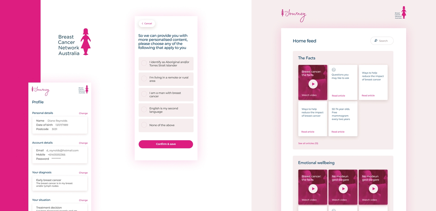
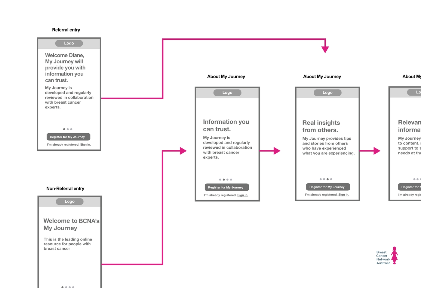
Using our research, coupled with BCNA’s business requirements, we designed a prototype of a digital version of the My Journey Kit, titled ‘My Journey’.
The prototype was developed to medium fidelity and thoroughly tested with six ideal representatives, guided by thoughtful design principles across accessibility, connectivity and delightability.
One example of the insights gathered is that typically a “good” user experience means onboarding is a quick or even non-existent part of using an application or digital tool of this manner. The user testing performed with our primary audience of women recently diagnosed with breast cancer found users wanted to slow down so they could take everything in and not feel like things were happening too quickly.
Referencing the insights gained from our user testing, and collaborating with the BCNA digital team, we proposed a Minimum Viable Product for approval using 15 detailed user stories, each outlining a key feature that was agreed to be present in the product for launch.
We also worked with members of the BCNA team to determine requirements and dependencies for the system architecture and technical stack of the My Journey application, ensuring it fit into the broader BCNA digital roadmap.

Phase Three - Design and Delivery
We undertook a sprint-based development process, delivering My Journey as a progressive web application, giving us more agility and enabling a faster time to market while ensuring management was simple enough for BCNA staff to be involved.
Prior to commencing the build, we developed a thorough Proof of Concept to confirm the technical feasibility and viability of the My Journey Application. Our team also wrote APIs to facilitate data management, ensuring that the processes were simple and that the documentation was readily available for reference by BCNA staff and future development partners.
To ensure that the brand was present and that users recognised a consistent style throughout the application, our team developed a pattern library and key templates. This included 6 template designs, 10 modules and a detailed style guide for basic content layouts:
- Articles
- Content Pages
- Landing Page Layout
- Menus
- Global Navigation
- Forms
- Resources
- Questions Users May Ask
- Pattern Library
To provide a fast, consistent and responsive user experience the front-end was built as a single-page web application using React. We utilised Microsoft Azure infrastructure and services for reliable and scalable hosting of the application, and seamlessly incorporated multiple third-party systems, including Salesforce and Umbraco, via APIs built by the Portable team.
Outcomes
The My Journey web app was successfully launched in March 2019, with more than 2,000 people registered for the service in the initial 3-month soft launch phase. With an average cost of $80 per user to send out the previous hard-copy paper kit, the cost savings of shifting to a digital platform were realised in a very short period of time.
Introducing a digital service empowered individuals to access information and support tailored to their specific needs throughout all stages of their breast cancer journey including early breast cancer, DCIS, metastatic breast cancer and survivorship.
The application has also significantly improved the level of care that practitioners can offer their patients as the effort required to collate information from the paper kit was considered resource intensive and rudimentary for its time.
As of completing the project, additional planned benefits being realised or on the roadmap for the business model include increased social connections, searchable resources, recommendations, referencing and sharing of content by and for carers, and breast-care nurses, as well as innovative fundraising opportunities.
The My Journey digital application is now in its fourth year of operation and has replaced the printed model as the key form of delivery.
Project Team
- Sarah Kaur - Lead Producer
- Simon Goodrich - Lead Client Partner
- Joe Sciglitano - Lead Designer
- Andy Kilham - Senior Developer
- Ryan Blandon - Systems Designer
Reflections
“Partnering with BCNA to work with their leading product and transforming this from paper to digital was a great experience. We demonstrated how we could tailor information to users, drive impact and help implement digital strategy through transformation across an organisation”
- Simon Goodrich, Co-Founder