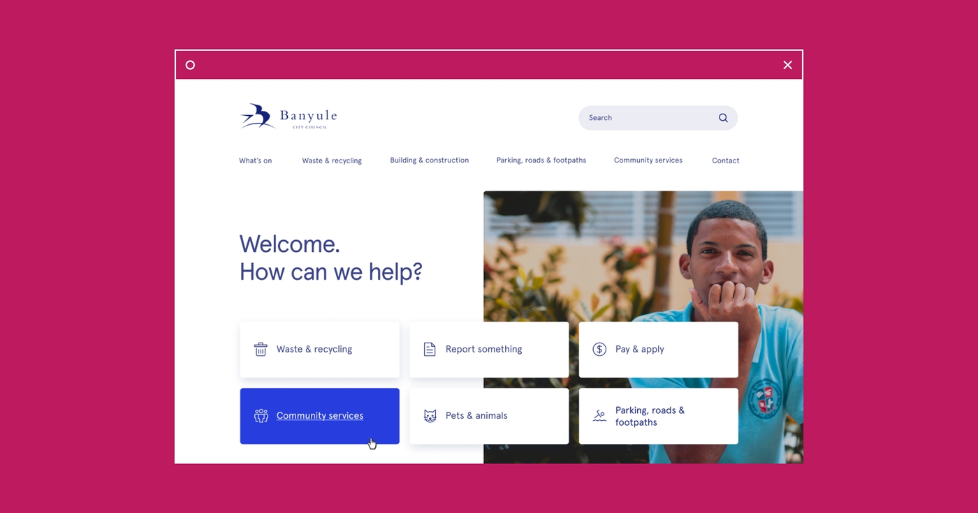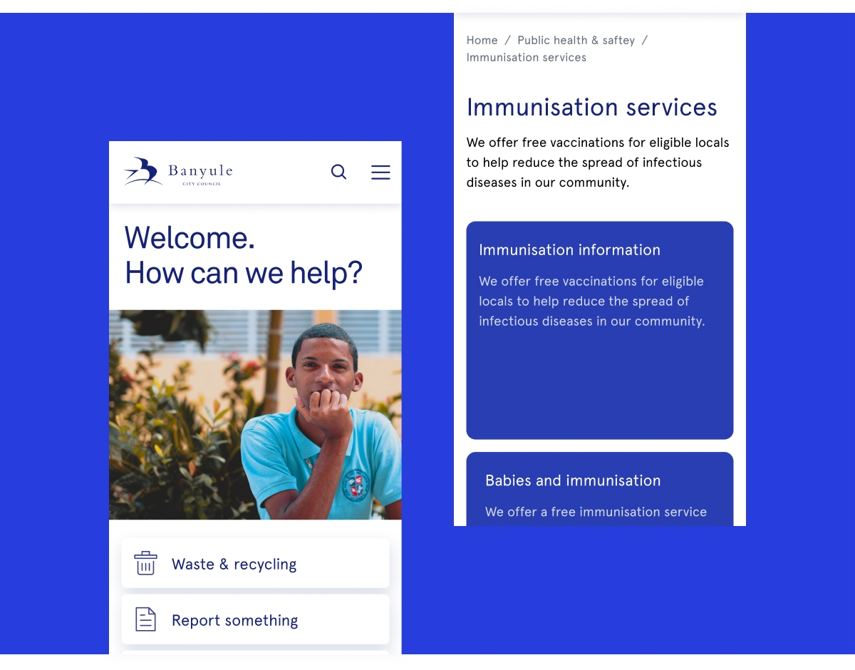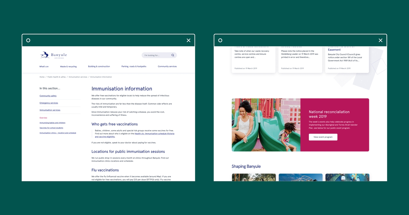
Banyule City Council serves 21 suburbs in Melbourne’s northeast, from Ivanhoe just seven kilometres from the CBD to Yallambie on the outskirts of the city. The Council recognised the need to update its website to improve content structures, functionality and to better serve user needs.
After conducting their own review of the site, Portable was engaged to re-design the site. We conducted a series of workshops with Council staff to define the identity the Council wanted to project, surveyed residents and then used that information to design the information architecture for the site and a new visual identity. We also developed a comprehensive content strategy to use across the council's website.

The expertise used in this project included:
Co-design
We began by conducting three content strategy workshops with staff; the first with the communications team and the other two with subject experts from across the council’s various areas of activity – including roads, rubbish collection, planning, facilities. The workshops helped develop an alignment across core areas of the ambition for the new design. We also ran a series workshops with members of the public in Banyule, to improve understanding of their needs and navigation behaviour. The workshops reflected the area’s diverse socio-economic mix. This was followed with an invitation for all residents to take part in an online survey about the website.
Web Design
Banyule City Council uses the Open Cities content management system, which provides a template specific to councils. All our work had to conform to the limitations of the Open Cities CMS, particularly the development of a new information architecture and the new visual design. We used Tree Jack to help evaluate the findability of topics on the site and to refine the information architecture. We analysed responses from 186 people. Through this we were able to validate the new IA (information architecture) and ensure that it reflected user needs, improved navigation and functionality and still conformed with the Open Cities CMS.
Content Strategy
We developed and wrote a new content strategy based on all our learnings. It supports a broader change management project and covers the lifespan of all content from commissioning through to the approvals and publishing processes. It puts users first, instead of focusing on the administration of Council or stakeholder priorities. The strategy includes reducing the number of websites and social media accounts operated by Council and improving the active management of those that are retained. It’s also guiding the work of an independent copywriter who is re-versioning all content on the site. The strategy is designed to be updated as user needs change.

Outcomes and benefits:
- An information architecture that reflects user needs, improves navigation and functionality and still conforms with the Open Cities CMS.
- A new visual identity that captures the Council’s commitment to putting the needs of residents first and reflects a broader change management process.
- A comprehensive content strategy that adds value to the work of Council staff and helps them to prioritise content. It can be easily maintained, updated and amended as user needs change.
Download our report on innovation in government
