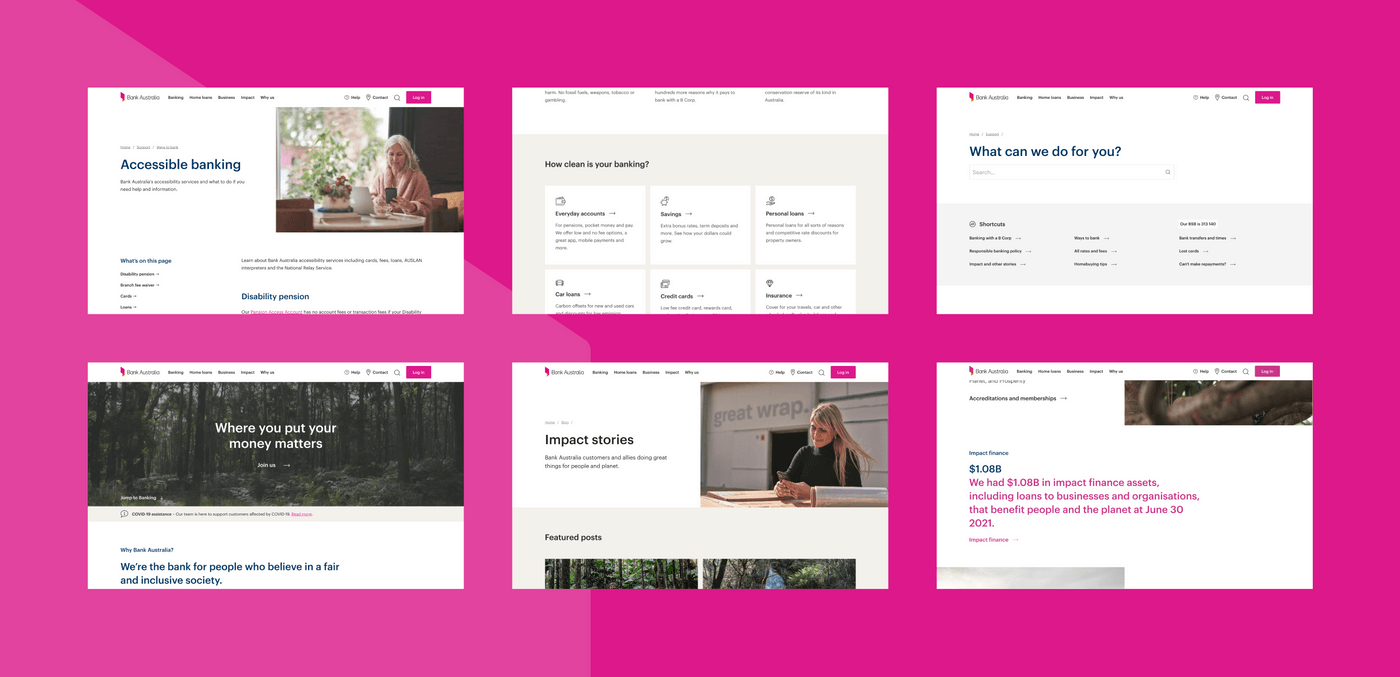
Bank Australia is an Australian, customer-owned bank that exists to inspire and empower customers to use their money to create a world where people and the planet thrive. A fellow certified B Corporation, Bank Australia promises not to use its customers' money in a way that will do harm to people or the planet. They call it the ‘clean money movement’.
Bank Australia had a strong desire to apply brand identity updates and improve customer experience on their website. They also wanted a mission-aligned, B Corp digital development partner who shared their ethical values and emphasis on clean money and investments. Portable, being mission-aligned to Bank Australia’s ethics and sharing a similar emphasis on being a values-driven B Corp, made the perfect partner.
We brought our experience in implementing custom web solutions for large government and not-for-profit clients, plus a strong knowledge of the emergence and growth of Webflow as a new type of CMS revolutionising the way client organisations can manage their content.
Portable’s technology and production team worked closely with Bank Australia and their network of partners to lead the technology approach and implementation over multiple sprints.

[Web design and imagery by Paper Giant]
Design challenge
Bank Australia’s purpose is “to inspire and empower people to use their money to create a world where people and the planet thrive” and the website plays a vital role in attracting and serving customers, as well as connecting them with other online services. Their website had been built some time ago and required a rethink.
The website redevelopment project formed part of a broader program of work that included the replacement of the bank’s digital loan application experience as well as the implementation of new marketing automation technology with a strong focus on customer experience, acquisition and retention.
In particular, a key focus of this website redevelopment project was the need for:
- up-to-date and scalable technology solutions to meet Bank Australia’s growing demands in an ever-changing digital world
- solutions to upskill staff and increase strategic capability
- brand consistency that represented their responsible banking ethos across all platforms
Bank Australia knew they had to approach this project from a human-centred design perspective. First looking at staff and customer needs and the pain points that were preventing them from experiencing the best possible user journey, then applying well-designed solutions to solve these issues.
Having already worked closely with their chosen project strategy and management partner, Harvey, and having received specialist strategic design and customer experience guidance and services from their chosen design partners, Paper Giant, Bank Australia selected Portable to complete the digital development of the build on their chosen CMS, Webflow.
In addition, the finance and strategic content team at WORDS for things were chosen to do the copywriting, information architecture and taxonomy for the new site, Good & Proper were selected to do the photography and Melorium were asked to complete analytics set up and support.
After a comprehensive evaluation process, Bank Australia selected Webflow to meet their needs of a marketing-led platform that could live up to the Bank’s expectations for a technology solution that can drive a positive user experience. Webflow provides flexibility and ease of management for Bank Australia staff through using it’s no-code features, providing the bank with a powerful tool to support external communications.
Approach
Agile scrum
We chose to use an agile, sprint-based approach for this project that began with a two-week planning sprint to align the entire internal project delivery team and the skill sets of project team members with relevant touch points of the sprint cycles. This approach allowed us to tackle the various components of the website build in a coordinated and efficient way, organise our team across the sprints and meet the launch deadline.
Collaborating with partners
Through robust conversations, we then agreed on ways of working and communicating between Paper Giant, Harvey, Bank Australia, and the Webflow team to facilitate a seamless partnership and outcome. We worked closely with the Paper Giant team to understand their vision for the site and the components and designs they provided us in a Figma design system.
Project management and strategy partner, Harvey, as well as the team at Bank Australia, also provided comprehensive introductions to the context of the web development project and the business and consumer needs driving the identified program pillars and goals of improving revenue, acquisition, retention, experience, technology, internal capability and brand.
As a Webflow Enterprise Partner, our Technology and Production teams had several meetings with Webflow to hear about their future roadmap, and learn of upcoming features that would benefit Bank Australia.
Digital development and cross agency collaboration
Once the project and partnerships had been set up for success, we began to set up the Webflow CMS architecture and infrastructure that would act as the blueprint for the project. Portable’s skilled Technology and Production teams then started the development process with the build of templates, symbols and collections in Webflow, building out the core website pages, then handing over completed pages in sprint cycles to Bank Australia and the project partners to finalise content and complete a design review.
Before the start of each sprint, the Paper Giant design team handed over the next round of prioritised designs to Portable. Portable's team then broke down the features and designs into tickets managed through JIRA and allocated the development tasks amongst the team at fortnightly sprint planning. At the end of each sprint, all teams attended a fortnightly showcase to demonstrate the newly built features.
Website features
New website features our team worked with the project partners to launch include:
- Questions answered before they’re asked with simple-to-navigate pathways into support and how-to information
- Putting the owners up front by sharing stories and images of the people who own the bank and Bank Australia customers
- A focus on putting user needs first with jargon-free language and a user experience in line with WCAG 2.0 accessibility standards
- Increased transparency by putting important details like rates and conditions in clear sight to go beyond industry compliance and help customers genuinely understand
Quality Assurance and testing
Our Technology team and Senior Developers worked side-by-side both with the in-house and Paper Giant designers, respecting design directives at every stage of the process and working with Paper Giant to review visual designs and micro interactions to ensure the implemented designs matched the original vision for the new site.
Using a no-code platform like Webflow as our build tool presented new challenges in ensuring quality. To be sure we met our own high standards, our tech team developed a new process that began with creating individual components.
These components were then rigorously tested on multiple platforms before being composed onto pages. Pages were then put through a multi-step review process before being declared ready for external design review.

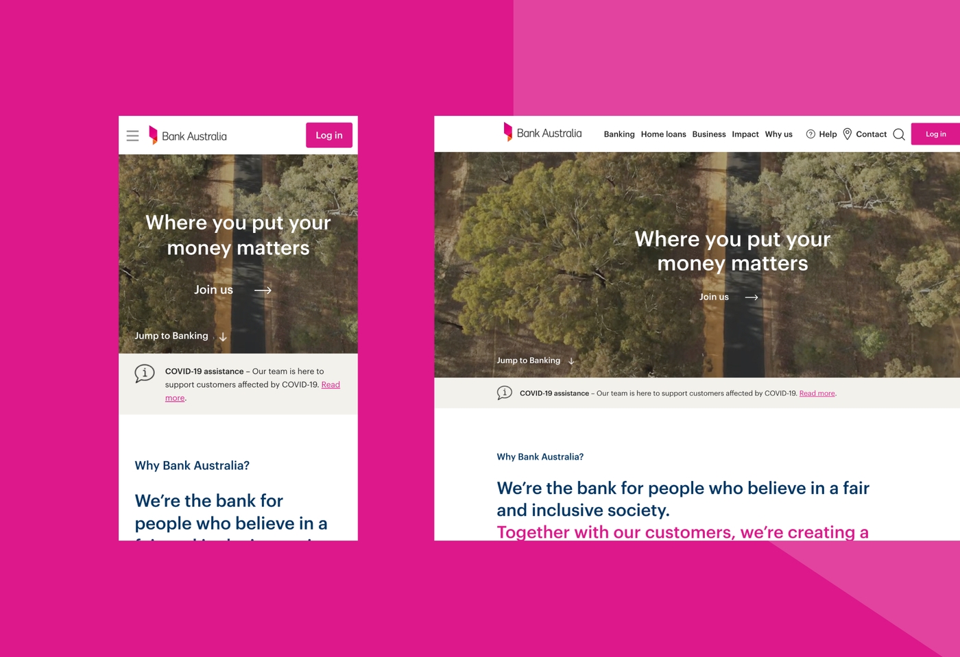
[Web design and imagery by Paper Giant]
Outcomes
The new website showcases the ethos behind Bank Australia’s brand, positioning them as a serious alternative for Australians seeking a more value-aligned way of managing their money. It provides a transformed initial entry point for potential and existing customers, ensuring the best possible digital experience.
Following extensive testing and feedback with bank customers and non customers, Bank Australia launched their new website in November 2021.
Reflections
Nicole Hunter, Head of Marketing, Bank Australia
“Designing a new website for Bank Australia was not such a straightforward task. That’s because we put our purpose at the heart and soul of everything we do, and our website is no exception. We are not like any other bank, and our website needed to reflect that in every way possible. To achieve this ambition it was really important to find partners who not only had the skills we needed, but who also share our values and our philosophy that business should be used as a force for good.
We think of our website as our most visited branch and a critical channel for growing the movement of people who are taking control of their money and using it to create a world where people and the planet thrive. Therefore it was crucial that it be built in a way that takes our customers on a journey. To not only easily understand our banking products and services, but to understand what drives us as a bank, and the importance of what it really means to be a customer and part owner.
And we are absolutely thrilled with the result. Our new website tells a wonderful brand story, it radiates with impact and purpose, it is simple and easy to navigate, it is functional, and it is beautiful.”
Andrew Apostola, CEO, Portable
“Part of our vision as a team is to create a world where business, technology and design are used as forces for good. Our partnership with Bank of Australia to create their new web platform has allowed us to further realise that vision with an organisation that cares as deeply about social responsibility and human experience through technology as we do. Ethical finance is an emerging battle ground for the public. This website is the beginning of Bank Australia’s digital led strategy and we look forward to this website evolving to the ongoing needs of the Bank Australia customers.“
Rick Measham, Lead Developer, Portable
“Bank Australia challenges what it means to make a positive impact in the banking industry. For Bank Australia it is more than just marketing, and rebuilding their website was a great opportunity for us to help the clean banking movement. Bringing our technical expertise to a multi-agency project required empathy and collaboration from everyone — especially from the internal team at the bank. I’m proud to put my name on this bank website.”
Portable's project team
Allison Snow, Lead Producer
Libby Tiding, Senior Producer
Samantha Bury, Senior Producer
Lincoln Le, Senior Developer
Andy Kilham, Senior Developer
Justin Ramirez, Technical Quality Assurance Lead
Chris D’Aloisio, Head of Technology
Rick Measham, Lead Developer
Kerri James, Senior Client Partner