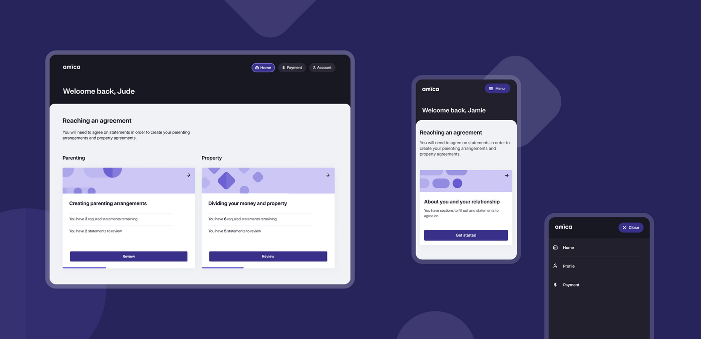
We have worked with the Legal Services Commission of South Australia for a number of years on the design and development of an online dispute resolution tool called amica, which helps guide former partners towards an amicable resolution of family law issues. It launched in 2020 and we continue to work on releasing further feature enhancements for the tool.
Our initial release of amica took a mobile-first design approach, with a strong focus on optimising the user experience for smaller screens. Continuing on from the launch success, and following user research that demonstrated high usage on desktop devices, the Legal Services Commission of South Australia was looking to enhance the experience for people using larger screens.
Our design team is consistently looking for ways to support the Commission in iterating on and improving the experience of using amica. Additionally, this was an opportunity to iterate upon the application's information architecture, and redesign the navigation, layout and core components to best suit multiple device and screen sizes.
Adopting a product mindset
Effective digital development of public-facing products should be treated as an ongoing investment, rather than a "one and done" project. By taking a "Minimum Viable Product" (MVP) approach, we can develop something that meets the most important needs and then launch it with the commitment of constantly improving it while it is live. This allows for ongoing investment and development in line with the value delivered and returned from your organisation to its customers. This is the mindset and approach we took in the design and development of amica and is the driving force behind our team working with the Commission on further enhancements and interactions to amica.
Design challenge
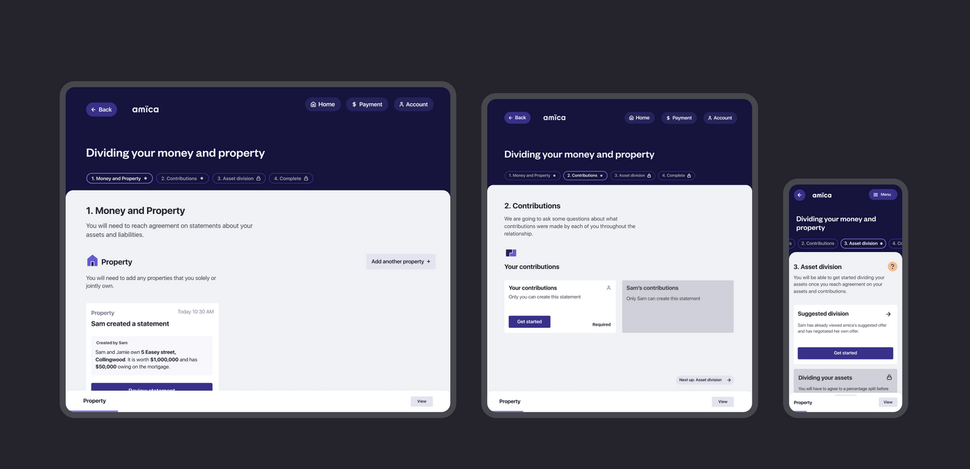
The complexity of tasks people needed to complete in amica called for UI improvements to assist users in better understanding where they are in the process. We wanted to establish a more granular approach to document sections, to help orientate user’s through their tasks. We also wanted to improve the experiences for the overwhelming percentage of people who are using the mobile web app on desktop devices so optimising the experience across larger browsers was key.
amica now covers a large amount of the separation process from sign up to relationships, parenting, suggested division and consent orders. Analytics and our own experience have shown us that the majority of users access amica on desktop. Given the application has been live for several months and with the introduction of payment into the process, it was important to review and improve on the existing structure which will set up the application for future enhancements.
Approach
Improving the experience of amica
Our overarching goal was to prioritise improvements that will allow us to iterate and improve the tool more easily in the future. Taking information from our user research and the statistics from the live application, we identified key areas to improve amica and make it easier for people to understand the separation process and reach agreement.
Understanding user needs
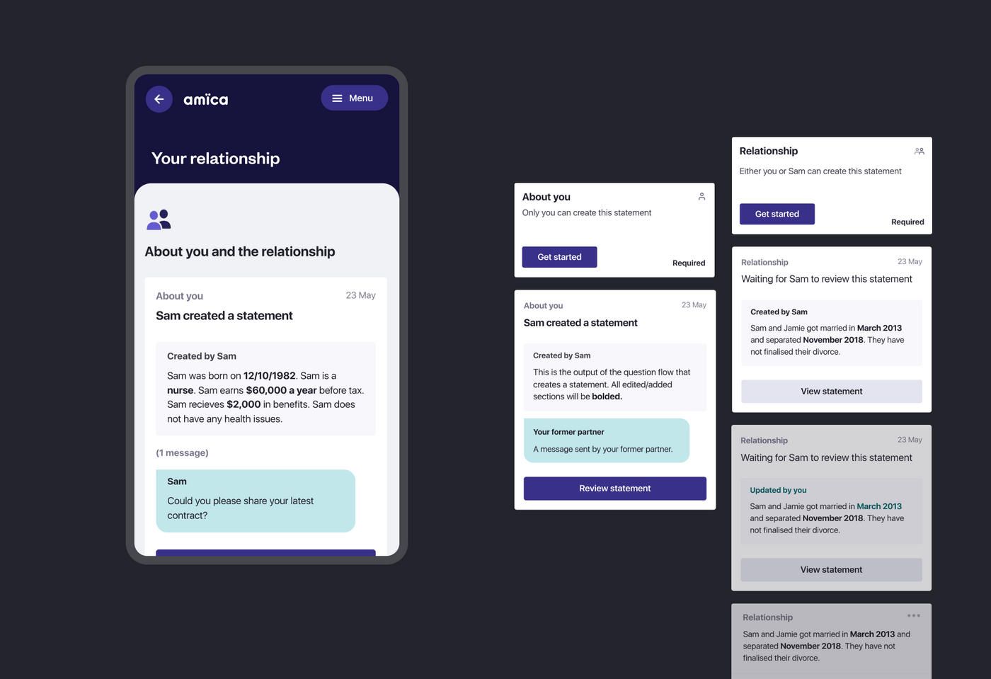
We met with existing users to learn more about their experience using amica and shared a prototype with some updates to the tool to further understand their pain points.
Some of the insights we gathered were:
- There needs to be greater visibility of all steps involved in the overall process.
- Users want to know what the end output looks like and how it’s used.
- There needs to be greater visibility on what is required by each party in order to progress.
Creating a desktop-friendly interface
Even though the app was designed and built mobile-first we were careful to take a forward-looking approach to building the app so that we could do progressive-enhancements to a desktop friendly design without having to undertake a major rebuild.
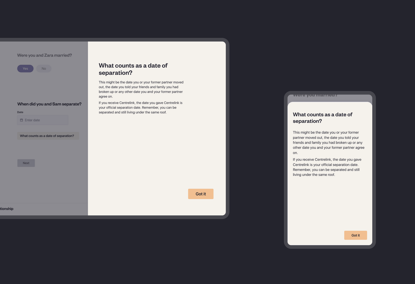
Our team started with an audit of the codebase and existing component library and identified key areas of concern and functionality that may not translate directly into a desktop environment. We then went about adding responsive elements - typography, spacing and desktop specific interactions like tooltips and hover states that simply do not exist on a touchscreen device.
Implementing the new interface on the front-end
The design and development team worked closely together to ensure the new elements were implemented correctly. Storybook allowed the team to preview and test components in isolation as work progressed. Storybook is an open source tool for building UI components and pages in isolation. It streamlines UI development, testing, and documentation. We also took the opportunity to refactor and improve stability - increasing coverage of our automated test suite.
Outcomes
Our design team believes a digital product is never done as all products require continuous improvement as new pain points and opportunities emerge. We’re currently working on improving other areas of the amica tool which we will be releasing later on this year. Stay tuned!
- We introduced a home screen that outlines the separate sections of the app, as well as give users a more holistic, clearer view of where they are in the overall process.
- We established a more granular approach to document sections and statements, to help orientate user’s through their tasks.
- We improved the way the tool works across larger breakpoints and optimised components to be more dynamic and responsive.
Testimonials
Jake Bonnici, Manager, Program Management Office, Legal Services Commission of South Australia
“From feedback gained across amica user groups, Portable went to work to improve user satisfaction rates of amica through the optimisation of the service through desktop design. As a client, Portable were able to instinctively identify our needs to deliver the project on time and on budget exceeding our expectations.”
Project team
Tom Morris, Senior Producer
Jackie Garfield, Senior Experience Designer
Andrew Fulton, Lead Developer
Andy Kilham, Senior Developer
Lincoln Le, Senior Developer
Download our report on using human-centred design in the justice sector
