As a child you were probably asked the question "What do you want to be when you grow up?", and were told to dream big and not to limit yourself. As a result, many of us would often change our answer — our dream job would range from doctor to sea explorer to teacher to astronaut, sometimes all in a single day.
Having unlimited space to imagine can be a gift. It is a great starting point for channeling your creativity and thinking beyond what is currently "possible". However, endless possibilities being laid at your feet without any kind of guidance can also lead to indecisiveness and a lack of direction. And this overwhelming number of choices that we faced as children is very similar to the blank slate that our designers work often face at the start of a project.
Our team are asked to dream big, to imagine what the ideal solution to a problem would be and then to use this thinking to create products and systems that are yet to exist. In order to do this, we have a set of design principles that we use to inspire us, to keep our responsibility for what we put out in the world at the front of our minds, and remind us of the things that Portable stands for and is not willing to compromise on (without a fight).
Our design principles
1. We design for people, not "users"
"Users" are predictable and have limited capacity. But we believe people are complex and capable of transcending limitations. We believe in giving people choice and the power to create their own experiences. We trust people to use what we design in the way that best suits them. (Inspired by Ted Hunt.)
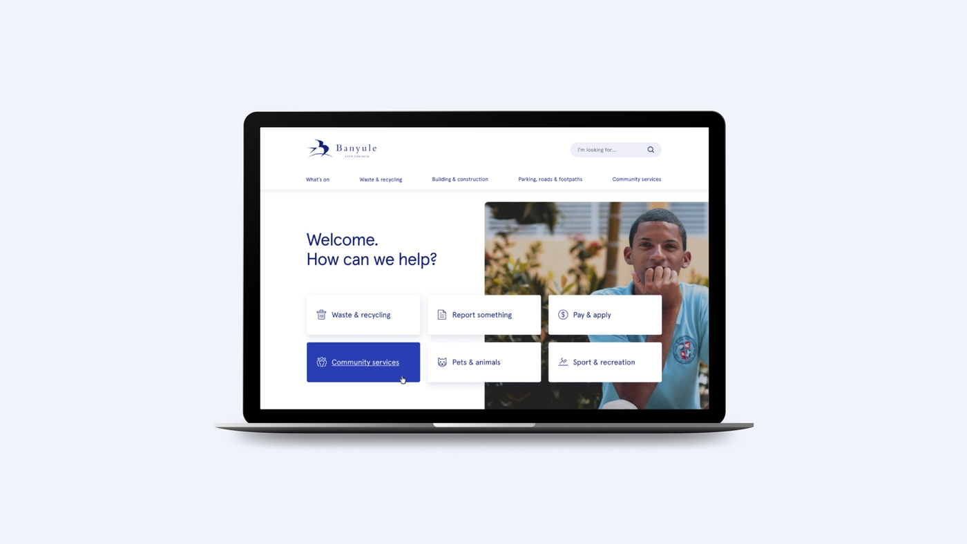
In our recent work with Banyule City Council this principle helped us to keep our focus on the people of the Banyule community. It fed into our co-design process where we consulted not only with council staff and experts but with members of the public through workshops and an online survey about the website. It also influenced the content strategy that we designed. This strategy puts people first instead of focusing on the administration of Council or stakeholder priorities and is designed to be updated as user needs change.

2. We design for all people
We embrace human diversity and strive for inclusivity in all we do. We see opportunities in people’s differences - whether they are physical, cognitive, cultural, or in other defining features of their identity. We believe that designing for those with the most unique needs leads to designs that benefit everybody.
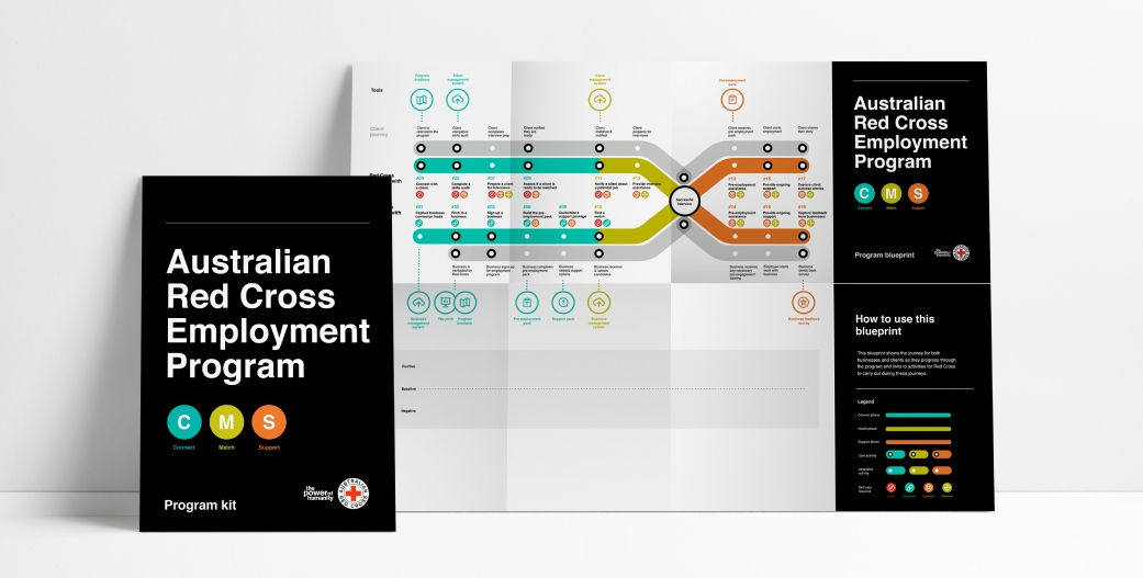
Our project with the Australian Red Cross to help people seeking asylum to identify and develop ways to foster purpose and personal agency and create new pathways and opportunities in communities was one project that benefited from this principle. Keeping human diversity and inclusivity in mind when designing for such a large and multi-faceted group of people helped us to refine their complex, interconnected web of needs from housing to social inclusion to mental health. We found that creating avenues to meaningful employment was a keystone for people seeking asylum. Beyond a pay check, being engaged in work was likely to improve many of the other issues faced by people — housing, mental health, social inclusion — by connecting individuals with a network of people in their community, and giving them a sense of purpose and hope in the future.

3. We design for impact
We design experiences not only for short-term, individualised outcomes, but for long-term, positive social and systemic change. We design measurement into our solutions so we can prove it. Simply releasing good design into the world isn't enough to make real change. We design solutions that are easy for people to promote, support, scale and sustain so that they gain momentum.
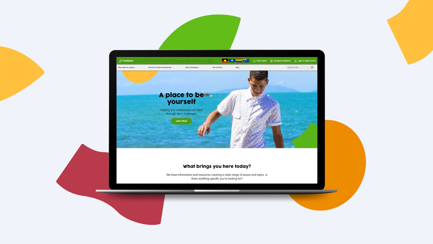
A project where this principle was at the forefront was our work with headspace to unify their digital presence. For this project we didn’t just redesign a website. We redesigned the pathways for users to seek help. By talking to and listening to users, we created pathways that reflect the preferences and behaviour of a very specific but fast-growing demographic - 12 to 25 year-olds seeking mental health services, and set up the headspace website to be able to cope with future needs by improving the current information architecture and navigation, and simplifying content management and service pathways. These solutions were derived from the findings of our user research, which identified several “design directives” that can continue to be used to guide future digital development: young people first, improve navigation, humanise the experience, encourage conversations and provide a safe space for self-expression.

4. We design for purposeful uses of technology
Technology is the most powerful tool in our toolkit, and we use it with intention and purpose. Our design decisions are led by people’s experiences and needs first, then we use technology to meet those needs.
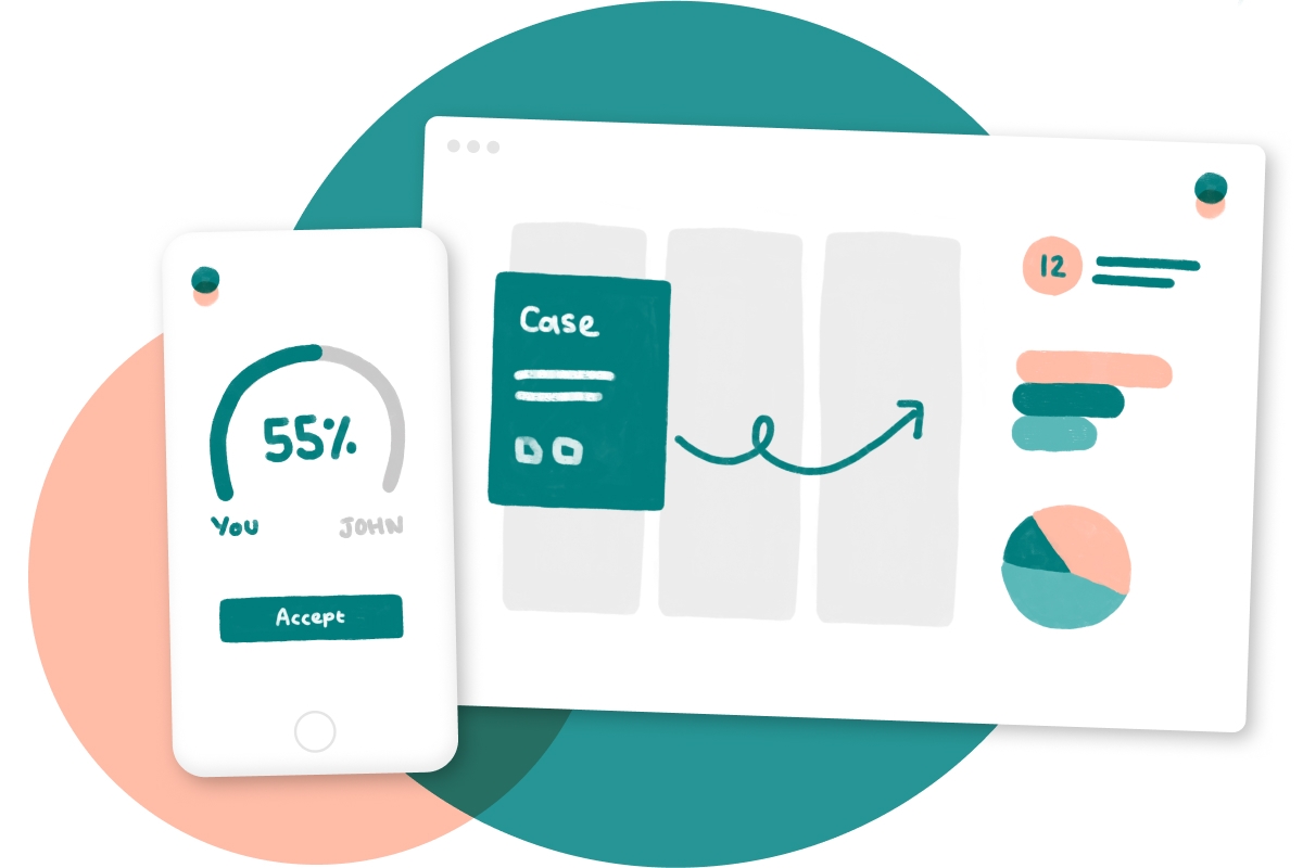
Settle, our online dispute resolution product, is one example of where this principle came into effect. In order to create Settle we deliberately focused on users’ experiences, rather than a specific type of dispute, piece of legislation, or existing technology. This helped to ensure the tool can be easily adapted to different contexts and disputes, including workplace, tenancy and property, and in creating this adaptability we were able to make this a more purposeful piece of technology that can continue to be used.

5. We design for the bigger picture
Good design doesn't exist in a vacuum. We believe the best solutions are designed with a consideration not only of their immediate context, but of the interconnected social, environmental, political and technological realities of the future.
We use this principles throughout our projects to ensure that we are producing the kind of work that we can be proud of and that will create the best solution for the people who will use it.
To find out more about about any or all of the work Portable is doing, email simon@portable.com.au