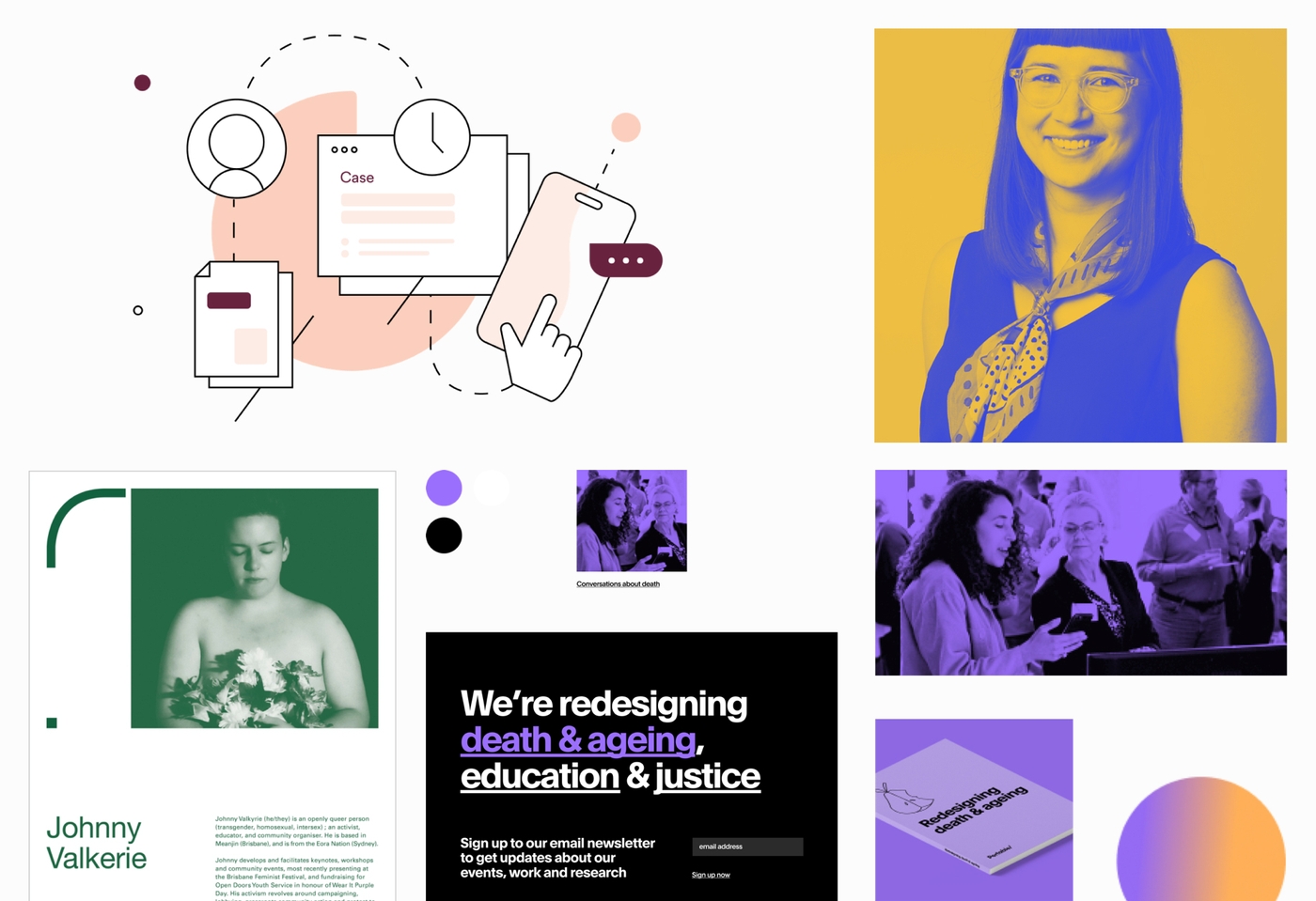
In terms of organisational identity, Portable already had an established ethos of using design for positive impact. Despite strong internal consensus on what we stand for, our actual brand collateral and outward communications lacked cohesion. Portable's brand was in a state of flux, with variance in how the design team approached the visuals each time a piece was needed. The creation, and use of assets, was even more difficult for those in the business outside of the design team. There were no clear parameters on the practical application of our brand, and more problematically, no distinct rationale on why they should care.
A strong brand helps establish a connection between a company and its employees. It builds pride. There is an underlying commonality in how you represent yourselves and the work you do. I wanted to ensure there was alignment across the business and that how we depicted ourselves externally, matched the quality of work that we were delivering for our clients.

Consolidation
Call it a refresh, consolidation or your buzzword of choice, the idea is the same; you're not starting from square one, you're building upon, and refining, what you already have.
We'd recently updated our website, had a handful of events on the burner and were continuing to pitch for new work with fervour - with no confusion about the personality we wanted to portray.
For this reason, I focused primarily on how best we could bring together what was already out in the wild, and ensure that new collateral felt congruous. The proposed approach was to establish a foundation that would underpin the overall brand. It was a mechanism to add validity to our existing visuals, and a guide for those needing to add to it in the future.
The importance of a strong brand foundation cannot be understated. Without it, you're baking in stifled scalability.
Often, brand guidelines are initially strong and resonate with a company's current iteration. However, as new opportunities emerge, additional brand applications are required and the risk of homogenisation increases. If a brand is underpinned by a strong foundation, it is able to grow and develop with the business. If a brand isn't bolstered by a foundation, internal design decisions get increasingly harder, and the subsequent rationale for them becomes weaker - 'the blue just makes me feel better, Luke.'
The Approach
Brand review
So, to quote a Tumblr post that almost certainly exists, "Sometimes, to move forward, you've got to look back". The process started with taking stock of the extensive work that had already gone into building the company over the past fifteen years. This included drawing from earlier brand visuals and existing documentation outlining our values, mission and purpose.
Movement as a key concept
Taking our history into consideration, and our day-to-day operations, the idea of movement showed as a through point, capturing the essence of Portable in many ways. Primarily, our name is already based on the idea of manoeuvrability. Our logo contains the slash, an icon of progression. Movement conveys the way we work, our dedicated approach to building, testing and ideating. There is also a connection between the concept of movement and our organisational mission. To create a movement is to initiate change - a fundamental aspect of the work that we do. Finally, movement felt true to the genesis of Portable, and it's grounding in entrepreneurship. The business has had several iterations over the years and has always adapted to meet opportunity.
Expressing movement
During the research phase, I explored ways that other designers had conveyed energy in a static design. You can gain a sense of movement through stylistic choices, like change in opacity, repetition, change in size, and the combination of stroke and fill. Additionally, movement can be achieved in the actual composition itself; by the intentional breaking up of text, and the overlapping of elements, conveying the depth of field. This was the methodology the team took into creating new visual assets.
Creating a colour system
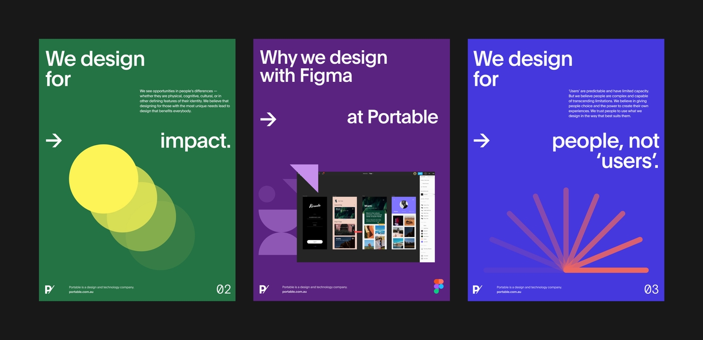
For the past few years, Portable's brand has been monochromatic for the most part. In researching colour for the new direction, I wanted to move towards a larger suite of supporting colours, that would aid the team in designing new assets at scale. The refreshed palette needed to accentuate the foundation of movement and convey a sense of energy. For that reason, I focussed on bright, saturated colours. From this initial exploratory phase, I put together this proof of concept; a series of posters conveying some of Portable's design principles.

Accessibility and colour
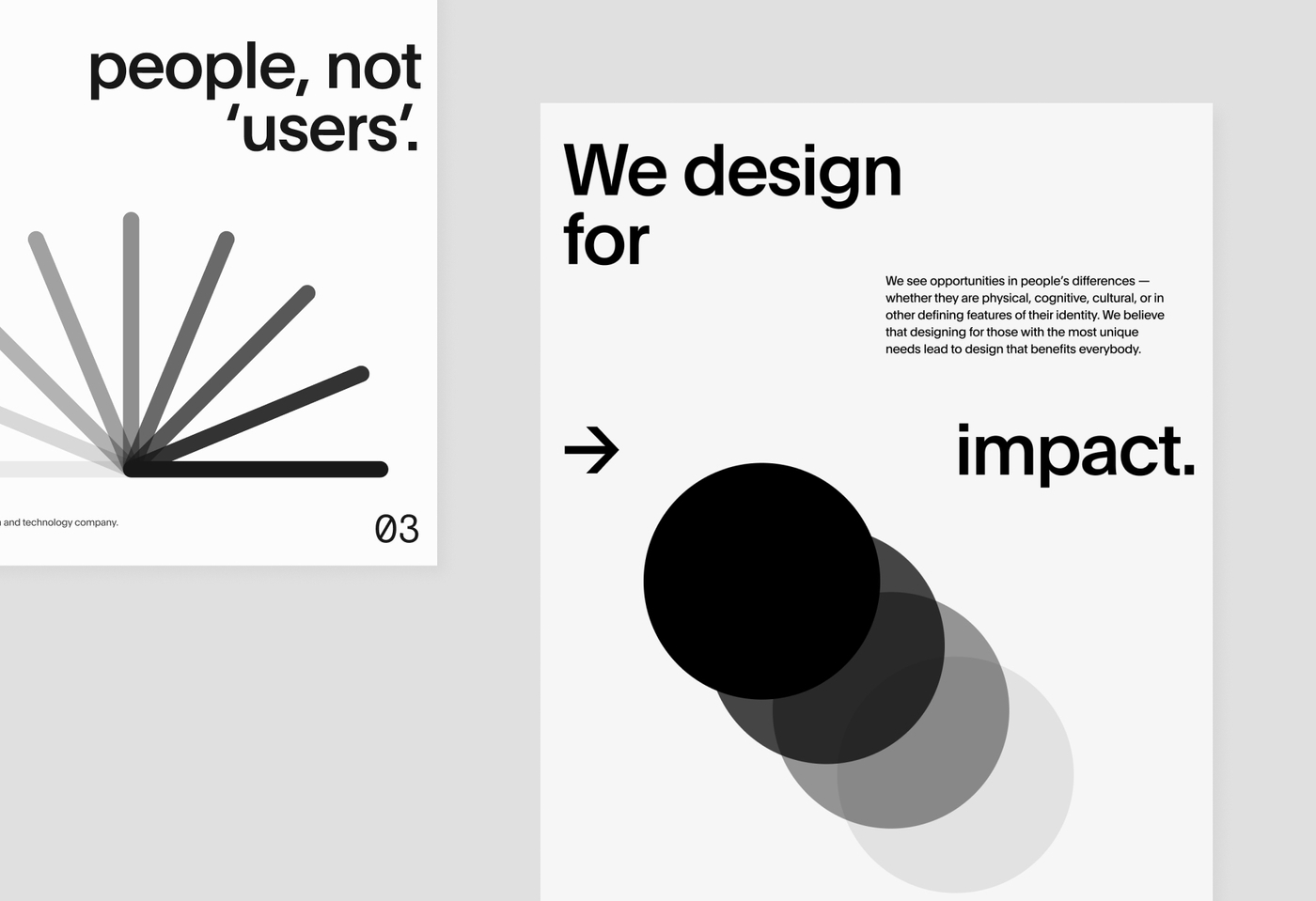
Accessibility is paramount in our work at Portable. We place great emphasis on the importance of inclusive design and creating experiences with users in mind. The new brand was no different. Though colour can add to the experience, it shouldn't be integral for understanding the concept. The visual approach we took, meant that the brand resonated, and was able to be understood, in greyscale and full colour. Additionally, text in our core brand shades meets contrast accessibility standards when used against our secondary palette; white on cool, black on warm.

Final colour palette
I then decided on our final palette which includes a dozen secondary 'pop' colours, six warm and six cool. These were chosen with versatility in mind and ensuring they were complementary to each other in design compositions. The naming convention is based on some of our favourite local spots in the Collingwood area, around our office.
Shape
Brand guidelines should do just that, guide. If they're too prescriptive, or not based in an underlying narrative, you develop variance and misunderstanding in how to approach new assets. So, on that note, and like all good art directors before me, I sought the help of more skilled visual designers to further the execution of the brand assets, and ensure that differing, consistent assets could be achieved from the same foundation.
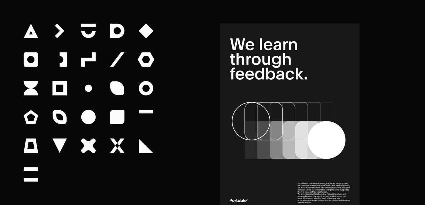
During this phase, we looked at the varying ways to convey movement in shape composition, and then group them in a way that correlated with our subject matter. These groupings would further aid the design team in the selection, and execution of new assets when required. The final groups were motion, transformation, balanced and exploratory. Additionally, as the team continued to create assets in the new style, it was apparent there was a myriad of styles for expressing movement and we were at risk of regressing back to detrimental variance in output. As a solution, we created a uniform library of shapes, that all compositions needed to be based on.

A final system
To ensure consistency, whilst retaining flexibility in execution, I wanted to establish a system that was easily understood by designers and non-design team members alike. And, allowed designers to build from the same starting point, whilst encouraging creativity and designing for the brief.
We built the final guidelines in ReadyMag, with an accompanying internal Notion page and Google Drive documentation. ReadyMag allowed us to create an easily navigated, always accessible set of guidelines that also encompassed the underlying narrative. This was a choice we felt would encourage the wider team to connect with the brand story, and therefore be more likely to care about its correct application.
I expect that these new guidelines, with allowances for growth, mean that you will continue to see how our brand evolves over time whilst staying true to its foundation, so watch this space!
- Jake Hogg, Design Lead at Portable